Skip to content

E-Jay Tripoli

A documentation of my work for Year 2 – Studying Games Design and Art at the University of Southampton

Menu
  • Lament
    • Development
      • Procedural Room Generation
        • PRG – Pt 1
        • PRG – Pt 2
        • PRG – Pt 3
        • PRG – Pt 4
        • PRG – Pt 5
      • Dungeon
        • Stalagmites
        • Pitfalls
        • Health Potion
        • Dungeon Bug Fixing
      • Player
        • Player – Pt 1
        • Player – Pt 2
        • Player – Pt 3
        • Player – Pt 4
        • Player – Pt 5
      • UI/HUD
        • Start Menu – Pt 1
        • General UI
        • Skill Tree – Pt 1
        • Skill Tree – Pt 2
        • Skill Tree – Pt 3
        • Skill Tree – Pt 4
        • Skill Tree – Pt 5
        • Skill Tree – Pt 6
      • Enemies
        • Whispers – Pt 1
        • Whispers – Pt 2
        • Wrought – Pt 1
        • Wrought – Pt 2
        • Boss
      • Scenes
        • Tutorial
        • Hub
        • Depression Gate
        • Gateway Scenes
    • Logs
      • Initial Plan
      • Teamwork
        • GitHub
        • Discord
      • Weekly Logs
        • User Analysis
        • Accessibility
        • Testing
        • Marketing
        • Formative Feedback
      • Playtests
        • Playtest 1
        • Playtest 2
        • Playtest 3
      • Showcase Event
      • Post-Project Reflection
    • Research
      • Understanding Learning Outcomes
      • Understanding my role
      • Researching Tools
      • Researching Pipelines
      • GDD Breakdown
      • Researching Procedural Generation
      • Existing Games
  • Arcadia GDD
    • Weekly Logs
      • Week 1 – What is a GDD?
      • Week 2 – Game Worlds
      • Week 3 – Concept Art
      • Week 4 – Character Design
      • Week 5 – Narratives
      • Week 6 – Gameplay and Game Systems
      • Week 7 – Feedback week
      • Week 8 – Audio
    • Research
      • Analysing Existing Games
      • Genre Research
      • Research into Psychological Abuse
      • Character Research/Moodboards
      • Environment/Map Research
      • Researching Medieval Knights
      • Researching Enemies
      • UI Research
    • Ideation & Development
      • Initial Development
        • The Essential Experience
        • Initial Game Ideas
        • Choosing a Game Genre
        • Choosing the Game’s Title
      • Game Play
        • Gameplay Loops
        • Mechanics/Tech
      • Story/Narrative
        • Twine
        • Summary of Narrative and Story
      • Game Art
    • GDD
      • Game Overview
      • Game’s Vision
        • Game Pillars
        • Project Focuses
      • Gameplay
        • Mechanics
        • Skills
        • Enemy Behaviour
      • Story & Narrative
        • Twine Prototype
        • Story
        • Narrative
      • Character & NPC Profiles
      • Map/ Level Design
      • UI & HUD
        • Creating the logo
      • Prototype/ Proof of Concept
      • Sound
      • Target Audience
      • Controls & Platform Specs
Menu

Creating the logo

Posted on December 22, 2024December 22, 2024 by et4g23

A logo isn’t necessarily the most important part of game design, however, it is one of the first impressions people have of a game. Therefore it is essential to be able to design a logo that is aesthetically appealing and gets the theme of the game across at the same time

Choosing the font

I wanted the font of the logo to be a simple, easily legible one – yet get across the rough yet regal theme of playing as a Knight.

At first, I chose simply blocky fonts with relatively bland colours, the black font was meant as a sort of ‘prototype’ to see the font blocked out. Then, I added the silver tint to mimic the steel of the Knight’s armour and sword. A staple of the stereotypical image of a knight.

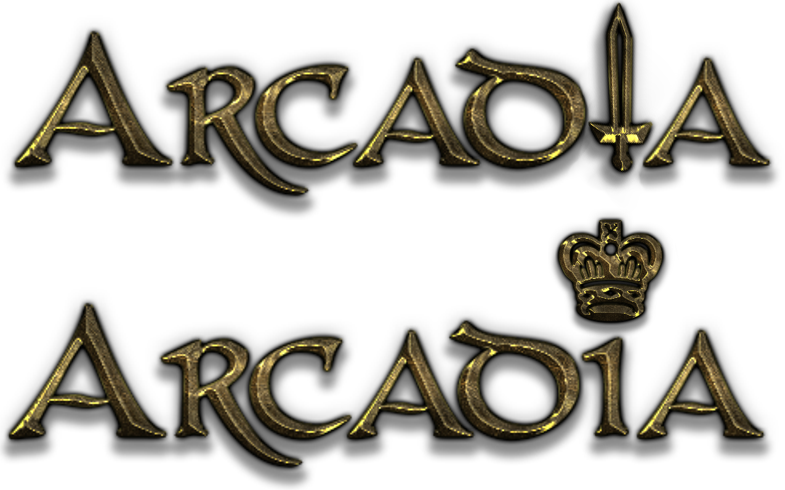
Then, I stumbled upon this font on a font generating website by the name of ‘CONAN’. It had the regal aesthetic of a Knight of the King’s guard, yet the rough war-torn look of a seasoned veteran of battle.

Lastly, I decided to put an icon within the logo to further portray the themes of the player character. Adding in a sword to replace the ‘i’ and a crown to replace the dot on top of the ‘i’. Ultimately, I decided upon the logo with the sword as I felt it captured the player character even further and looked better overall.
Leave a Reply Cancel reply

Your email address will not be published. Required fields are marked *

©2025 E-Jay Tripoli | Built using WordPress and Responsive Blogily theme by Superb