A logo isn’t necessarily the most important part of game design, however, it is one of the first impressions people have of a game. Therefore it is essential to be able to design a logo that is aesthetically appealing and gets the theme of the game across at the same time
Choosing the font
I wanted the font of the logo to be a simple, easily legible one – yet get across the rough yet regal theme of playing as a Knight.
At first, I chose simply blocky fonts with relatively bland colours, the black font was meant as a sort of ‘prototype’ to see the font blocked out. Then, I added the silver tint to mimic the steel of the Knight’s armour and sword. A staple of the stereotypical image of a knight.

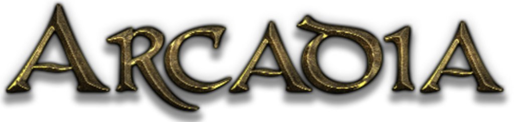
Then, I stumbled upon this font on a font generating website by the name of ‘CONAN’. It had the regal aesthetic of a Knight of the King’s guard, yet the rough war-torn look of a seasoned veteran of battle.
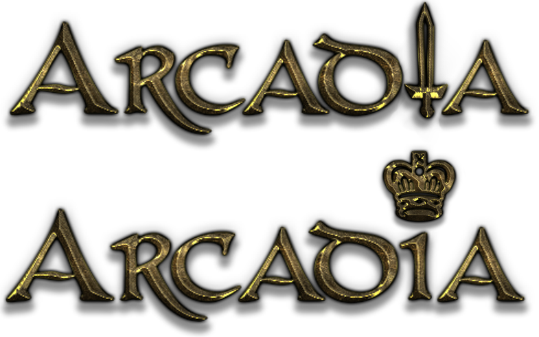
Lastly, I decided to put an icon within the logo to further portray the themes of the player character. Adding in a sword to replace the ‘i’ and a crown to replace the dot on top of the ‘i’. Ultimately, I decided upon the logo with the sword as I felt it captured the player character even further and looked better overall.