The Logo for my game will help it form a strong coherent visual identity. Since the style of my game is one of its selling points, I wanted to take inspiration first from other Game logos and visual artists using Pinterest as a tool to gather sources. These are my inspo pictures:
For the project, I’m drawn to Logos which reference items, characters or the main themes of this case. For example: The Animal Crossing: New Leaf logo showing a leaf, and a clock (symbolising the importance of time in this series.) For the Everything Mundane logo, it’s just as it says. All of the object depicted through each other the letters shows a part of mundane life for the artist, but for many other people too. The use of objects that most can recognise such as books, pencils and pizza make this logo visually interesting to look at.
For the other images such as the Shucks! and Karma!, I love the bold pop-out style that draws attention to the piece. It gives a whimsical sense of frenzy, like something needs to be looked at, and it’s a really fun style that I want for my logo.
So what about my Logo?
Here is the first iteration of a design I sketched in Photoshop.
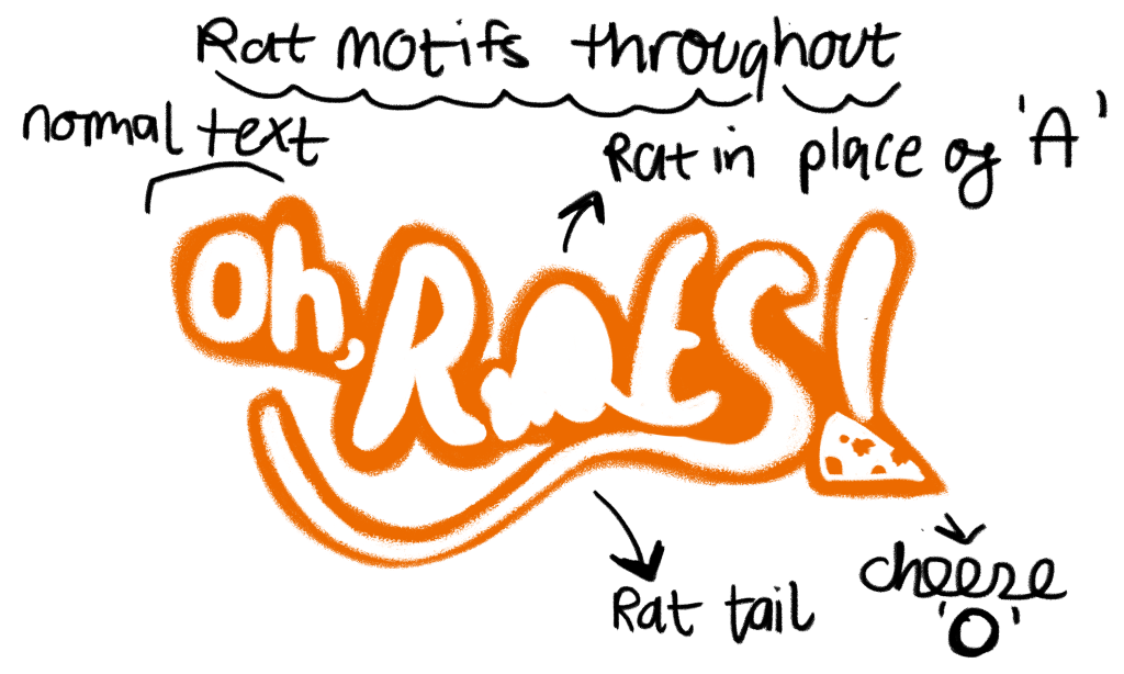
I really like the use of Rat motifs. The A is a silhouette of a Rat, the S is a Rat Tail and the ‘o’ of the ! is a cheese! I think you can see elements of inspiration from my moodboard. I love the “fuzzy” part of the lettering that you can see if you look closely.
Second Iteration
I used the font Sybil Green as a base. In Adobe Illustrator, I edited the S to become a tail and made a cheese with holes in it. I like this iteration a lot, however, I got some feedback suggesting that I should make the lettering thicker as when zoomed out, the logo becomes washed out with the thin letters. I think thick lettering suits the game style more anyways, but I did like the sharp “ratty” look of the font.
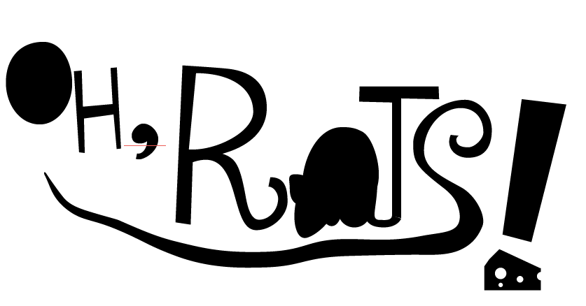
Third Iteration & A Change of Heart
Erm… So what went wrong? I was working on this iteration and I had the realisation that I did not like the design! It’s pointy, yet round and too many shapes going on at once (and not in a coherent way…). The yellow doesn’t work here. Why did I make it yellow? The design looks too hollow and soulless. The tail is wonky. It all just… looks like the very antithesis of this game. It is not what I envisioned for this logo at all and it was very frustrating to look at.
Dramatic, I know, but I was losing hope for my design when I realised that I could try something new. I opened Photoshop, sketched away and I think I made a design that made me feel way better about the logo…
Final Iteration
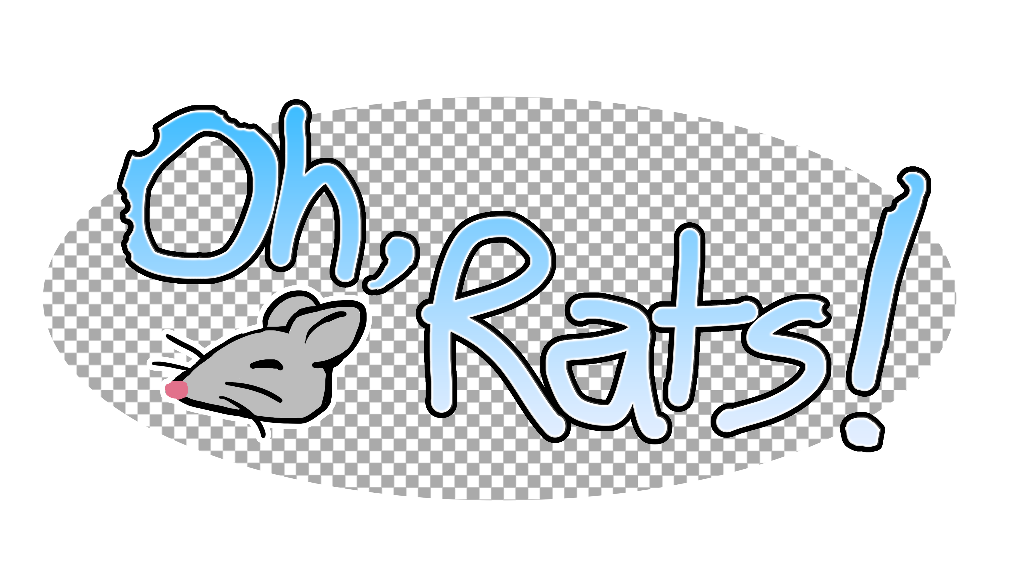
It’s wacky, fun, and imperfect but it has a rat… I think I finally smiled for the first time at this logo. The creative process can be very very chaotic, but it leads us to fun results, like this logo! I drew everything except the transparent background myself. I wanted to add some “whimsy” to this game, and I think the hand-drawn element adds a personal touch. The little rat in the bottom left is a cute drawing and I think it could even be used as a logo for my blog, so a pat on the back for accidentally making a site logo for myself! The colour scheme is pretty coherent, the most prominent colours are blue and grey. The transparent background makes it fun to look at. You’re not supposed to keep it when designing, yet it’s in my logo! If I were to make this game into a paid game with complete assets and storyline, I think I’d change the font but keep the rest of the elements.
This logo works because:
- It still keeps the “item from game” aspect
- It has some of the font chewed to further hint to the intent of the game
- It has a coherent colour scheme
If there’s one lesson to take away from the creative process of logos: sometimes the thing you make in an hour will beat something you made in 3 hours. Creativity isn’t linear and comes in bursts. Keep drawing and you’ll get to a satisfactory result.