- Title And Menu Screens
There are many different ways to approach designing a menu screen, it should be influenced by the aesthetic and tone of your Gameworld. Objectively a menu can be well designed whilst still being considered bad design; why? When the UI does not align with the game neither in tone or aesthetic it can oftentimes feel out of place and ruin the player experience. Player immersion is a critical aspect of a game, and having assets that are out of place and don’t fit in with the overall aesthetic can ruin this immersion. So how can I make my menu design feel immersive?
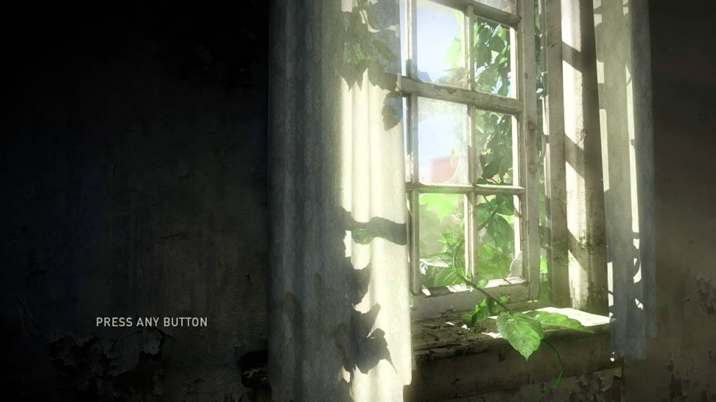
One of my personal favourite title screens has to be from the last of us. Not only is it visually stunning but also very simplistic and exceptionally easy to navigate.
The technical simplicity of the title screen tied in with the beautiful imagery creates a balanced design. The minimalist layout is user friendly, whilst the atmospheric artwork behind ties in with the aesthetic and art style of the Gameworld.
There should be little doubt that the last of us title screen is one of the most iconic within recent gaming history. Its design managed to become something of great visual recognition. This title screen actually inspired one of my friends to get a very similar design tattooed, this level of impact is something to be greatly admired. Not only did it manage to set the tone for the game but also established a lasting visual impact.
Whilst the visual design for the last of us is not something that aligns with kinetic panic aesthetically or visually, with our game having a cheerful, playful and vibrant Gameworld; it can still be important to understand the different ways in which others have managed to have a consistent aesthetic within their game and title screens.
The title screen for Stardew valley reflects the games colourful, indie aesthetic. It is both visually appealing and easy to navigate, aligning great with the overall tone of the game. This aesthetic and ‘vibe’ is much more similar to that of Kinetic panic in comparison to the last of us.
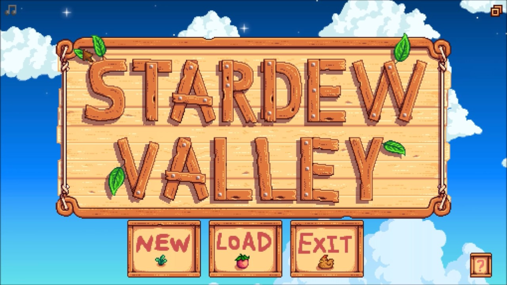
Stardew valley’s title screen employs the same pixel art style used in the game throughout its core gameplay, just with more definition. The design choice to have the title screen be pixelated still yet have it be in a higher quality image helps to maintain consistency whilst still having it be easily readable. By increasing the amount of pixels just within their title screen they allow for more detailed and refined UI elements.
Our game Kinetic panic can benefit from similar design choices, with the style of the game being very simplistic and cell shaded as of the moment replicating this design choice within the title screen is something i could explore. As i have seen how it is possible to remain consistent to the core gameplay whilst still adding this level of extra dimension within certain aspects.
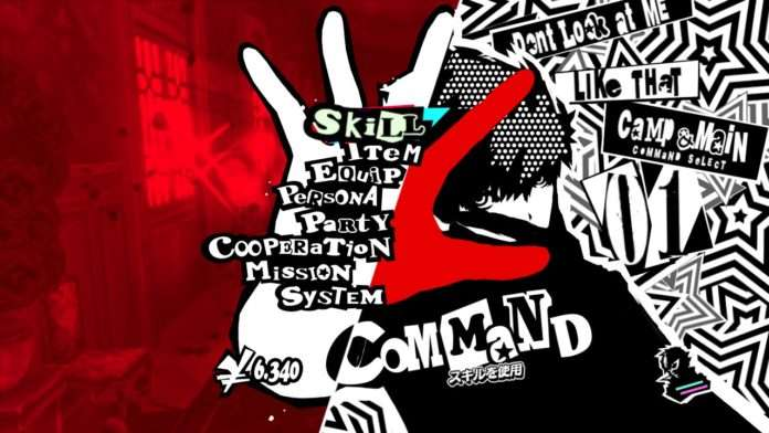
When discussing the stylisation of menu and title screens within videogames, the persona series undoubtedly stands out as a great example. The title screen is not only visually stunning but it also aligns seamlessly with the tone and aesthetic of the game.
Including these bold graphics, monochromatic colours schemes and very evident stylisation persona displays the ability to have the title screen be an extension of the game itself. It is flawlessly immersive. Clearly the style and tone of this game is greatly different to Kinetic panic, but the persona series displays a visually stunning level of detail even through its typically cell shaded style. Them carrying this over into the title screen is something i hope to achieve within my own designs.
Overall the design of a title or menu screen can play a critical role when establishing a players initial impression of a game. It should create a sense of immersion for the player. whether it be through a technically minimalist yet visually stunning design such as the last of us, a charming pixelated screen such as Stardew valley, or an exceptionally unique and bold game such as persona each game finds its own way for the UI to work as an extension of the game. Whilst kinetic panic is visually and technically much different from many of these games it is important to have a broad understanding of what is most important during the design process and what techniques or choices I could employ within my own work.