As the UI designer it is my role to ensure that the user interface integrates into the Gameworld. It is important to maintain the aesthetic of the Gameworld so that it is coherent throughout the rest of the game whilst also creating an experience that is easy to navigate and user friendly. Achieving this can be a difficult task as there are many different aspects of a Gameworld’s design and often varying different opinions on what designs would integrate better. Personally when starting to design for any big project I find it extremely useful to create drafts and different varying designs to gather peoples opinions before refining these designs into something ready to actually be put into a game.
- Settings Drafts
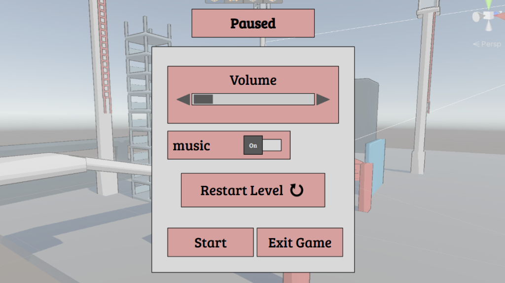
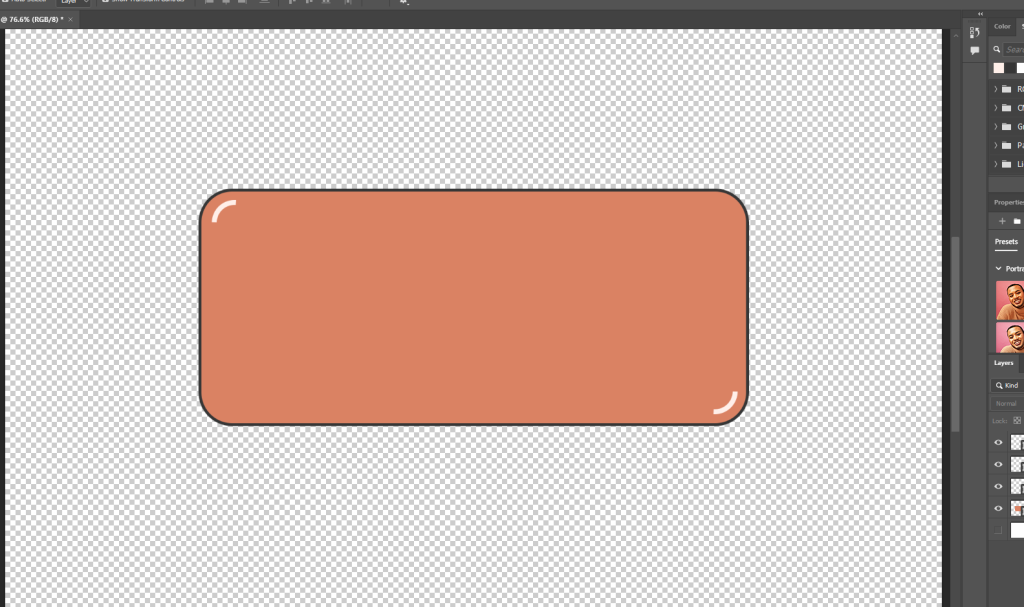
Draft One
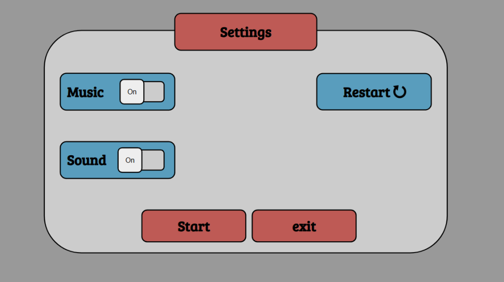
Draft Two
At this stage I have began to design very rough prototypes for the UI design. At this stage the design itself lacks the overall refinement and level of detail I am looking to develop. The purpose of these iterations is to to allow for feedback and opinions of both my peers and potential players of Kinetic Panic. In the spirit of honestly neither of these potential designs are something I am pleased with. Both options feel uninspired and are most certainly something i can heavily improve on in the future.
Despite my disappointment with how both of these iterations turned out I still decided to ask both my peers and potential customers to review which aspects they either enjoy or dislike.
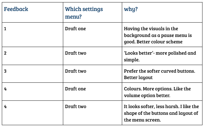
Overall the feedback for these drafts indicated a preference for draft two. This outcome came as a surprise to me as I personally preferred option one. However, the people have spoken. One thing that was commonly mentioned in its preference was the shape of the buttons, people preferred rounder softer edges as they were less visually harsh and more consistent with the games overall tone. This is a key example of how important garnering feedback for your designs can be, even as the designer you yourself can oftentimes prefer an option differing to that of your players.
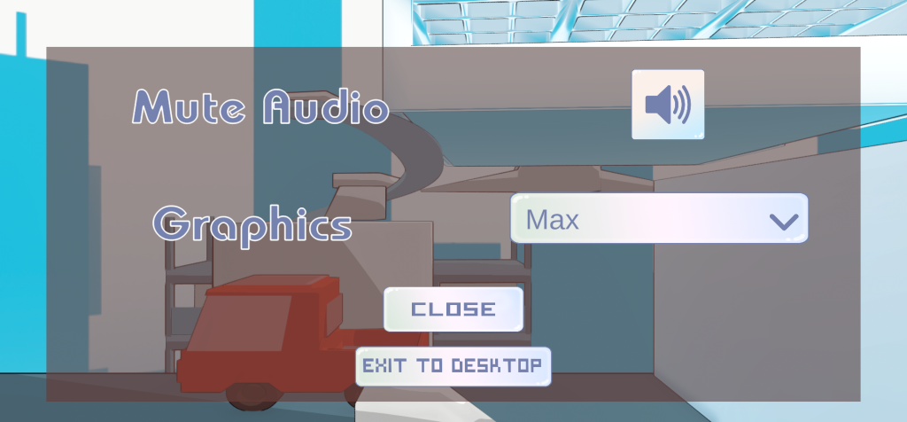
- Refining the Menu
Moving forward my goal was to ensure that the user interface more closely aligns with the overall aesthetics of the game. In the earlier drafts the UI was very simplistic and lacked depth. Whilst simplicity can be important in UI design to lessen player confusion and have the game be easier to navigate following both my personal opinion and the feedback I received I felt it necessary to create a more intricate design that fit better with the game.
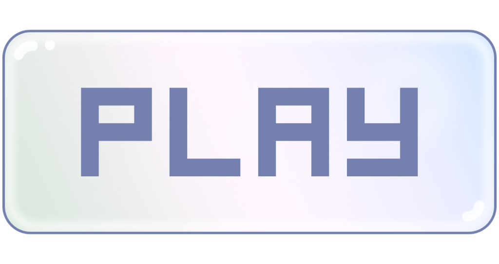
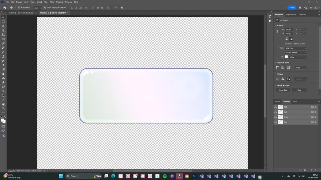
This basic button design was inspired by both Parker’s initial concept for the player character and Esi’s later rendition of that design. My aim for this design was to recreate the orb surrounding the character which i would then put into button from, including this aspect from the Gameworld itself and then implementing into the design of the UI is a great way to have everything read more coherently to the play. The result for this is something i believe resonates with the games aesthetic and having visual interest whilst still being easy to read for the player. As seen in my research into good title screen and settings designs having this consistency with the style of your Settings menu can greatly improve player immersion and makes it better it into the Gameworld.
- Creating The assets
When creating the base design for the buttons I used the square tool within Photoshop. Initially for these assets i was going to be using vectors as they are easier to blow up to bigger sizes denpending on the screen size of the potential plays. Yet because of the nature of vectors they tend to have a much larger file size in comparison to a png, hence my choice to create and upload the assets to unity in png format.
I opted for curved edges in the icon designs, this decision was initially because of the pervious feedback on my earlier drafts. The square button came across more harsh, this choice wouldn’t have fit well into tone and aesthetic for this Gameworld. So in response to this critic I started exploring different designs, using my research on existing UI design to settle on a shape better fitting. This choice is actually what led to the idea of the button reflecting the player characters orb. At first I was trying to design the UI around the orange and blue colour scheme prevalent throughout the game, whilst i feel as though this would’ve worked well within the Gameworld I much prefer the design I ended up settling on.
To achieve the bubble-like texture i created a custom gradient map and applied that to the base shape. For the colour pallet of this I referenced Esi’s rendition of the player character artwork to ensure that the UI elements would be coherent with the rest of the game. I have consistently associated the characters orb with a bubble, due to its colour scheme and transparent like visuals. I used this interpretation to influence some of my design choices, adding in white highlights and elements so the button would better resemble a bubble.
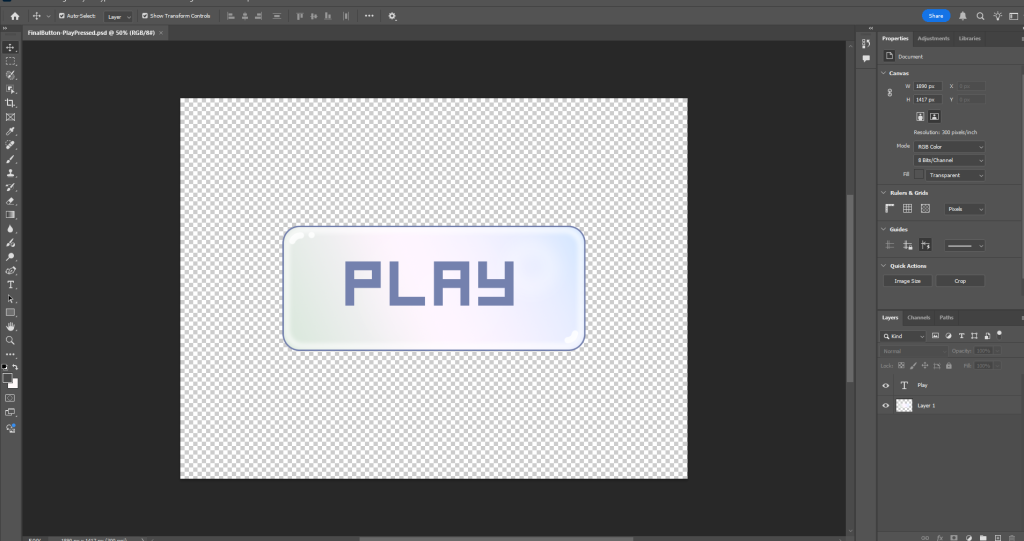
In UI design almost every design choice has the ability to impact and influence both the visual coherence of a game and its players experience. Unexpectedly selecting a font for the menu buttons was something that proved to be very time consuming and conflicting. Before this project I would have never imagined myself spending so much time trying to find an appropriate font. Eventually I did manage to find a font that i felt was both readable and coherent with the rest of the game. The reason this task was something I found myself contemplating was because I had initially set out to find a font similar and with the same ‘vibe’ to the tittle that parker had previously created.
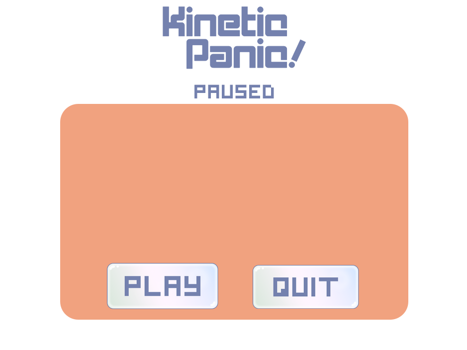
The progression from my initial drafts to the current more refined version is a simple yet drastic change. At a base level the UI is very similar and includes the same components, yet overall I feel as though this version is both more user friendly and visually appealing. With now having these core UI design elements designed and a more refined idea of the aesthetic going forwards I can progress onto implementing the menu and settings screen into the game.
- How it looks translated into the game
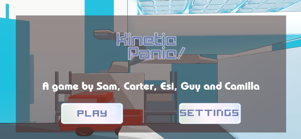
Although the title and settings menu components for the game did not translate into the game exactly how i had originally envisions, ultimately i am pleased with the visual effect and overall aesthetic it contributes to the final product. Adapting designs as i go is something I have found challenging in the past as once i have a version i tend to want to recreate that perfectly. In this case i was initially very attached to the idea of a more coral rounded background for the title screen. Despite this i am pleased with this alternative outcome. To me this experience and how the settings menu turned out has highlighted the importance of adaptability within work, allowing a design to evolve.
- Drafts and refences for mechincal Ui
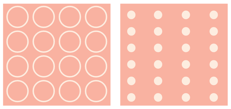
This is the initial mock-up of the elasticity mechanic parker had mentioned being within the game. With the larger circles representing higher elasticity and the smaller circles displays surfaces with lower elasticity.
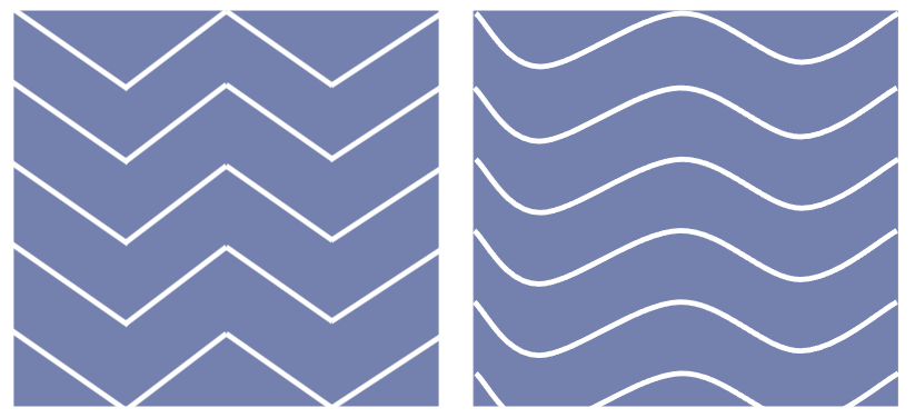
Another mock-up, This time for the friction mechanic for the game. The sharper more harsh lines would be on surfaces with higher levels of friction whereas the softer lines mean the opposite.
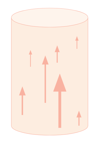
This is visually how the gravity mechanic should look in game. Parker described this ability as having a circular radius. The arrows represent the direction of the gravity to communicate this more clearly to players.