Before i start on my character design it is important to explore different potential visuals and styles I may want to include since I don’t yet have a clear direction in terms of the games art style or even the main characters design. I’ve collected a series of images i feel as though fit the ‘vibe’ or aesthetic that i am going for when it comes to the player character.
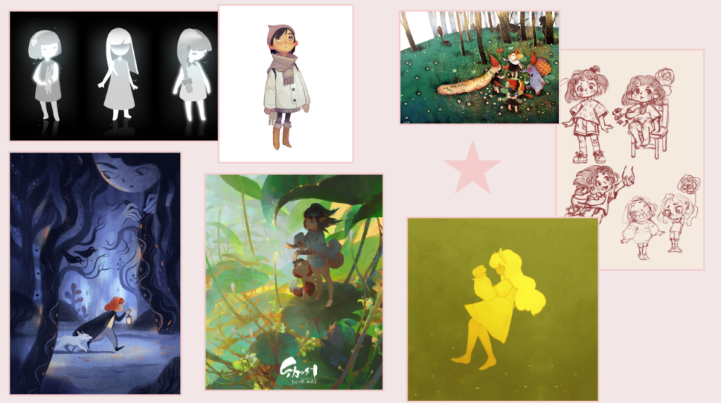
So far all i know is that my player character is a child, i haven’t yet decided the art style or atmosphere visually for my game and planning this character should serve as a great starting point. Since i know i want my game to have a overarching theme of nostalgia i collected together some concept arts that i feel achieve this well. One consistent that i have noticed through almost all these artworks is a ‘scratchy’ child like art style; similar to that of children’s picture books. I love the way this effect works with the pieces that it is employed in, it pushes a childish atmosphere. If i could replicate this effect within the art style of my game it would be a really effective and visually pleasing aspect to its design.
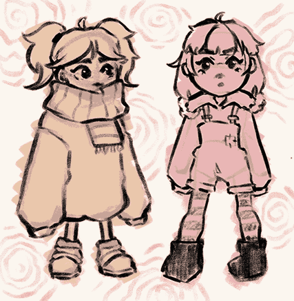
moving on, another key thing that i have noticed is how often artists tend to draw children in oversized or loose fitting clothes. choosing to put these younger characters in larger more oversized clothes can emphasise the fact that these characters are objectively smaller then their environment. This choice in design is seen multiple times for a reason, it works. This is something that i plan to explore and try within my own design renditions.
Now that I had a more clear direction on the inspiration on what my character may look like i started working on some quick rough thumbnails regarding the player characters design. One challenge for this part of the project is that i have very little experience in drawing young characters, considering i want to develop my artistic skills focusing on one of my weaker areas may serve as a struggle but serve me positively in the long run.
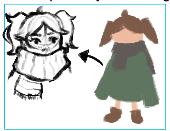
In class we tried to create a rough and simple design for our characters using shapes then moving onto refining the design slightly. Surprisingly I really liked the outcome of this design and have expanded further on this, trying to capture the essence that i liked in each rendition. I’ve tried to include oversized clothes to emulate the effect that worked so well from some my mood board concepts.
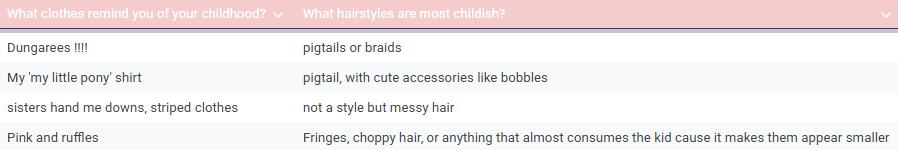
I had a couple friends give me short answers on what design choices would remind them of their childhood or give off a more childish tone. For the sake of nostalgia i understand including things such as my little pony or other iconic themes from our childhood, but when it comes to the games industry this is something i would have to be careful about, hence im choosing to not include any clear references within my characters or environment. Although i may look into including small ‘hints’ or easer eggs to have that sense of nostalgia some might miss.
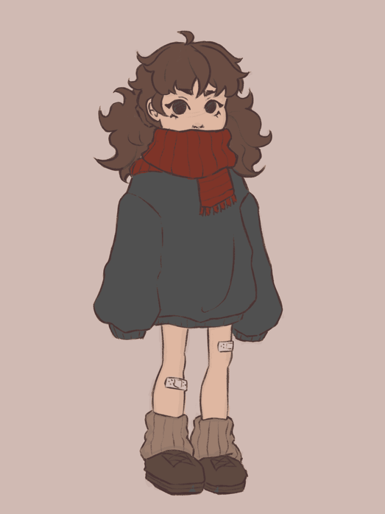
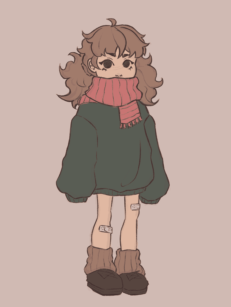
When it comes to the more childish hair styles pigtails or braids were the most mentioned, already my design renditions of this character depict her with pigtails since was the first thing that i considered. Simply because it is the first thing i considered doesn’t mean that it wouldn’t work well within the character design, infact i especially like the silhouette it gives the design; simple but interesting. One thing i hadn’t yet considered that this feedback mentioned was not only the style of hair but also the maintenance, children can often be seen having ‘choppy’ hair cuts and generally frazzled, messy hair.
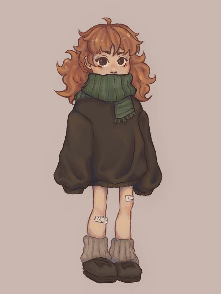
I have combined a some of my favourite aspects of my original design and taken into account the forum i had my target market fill out. The hair was a struggle for me, i wanted it to look choppy, slightly tangled yet still have volume and length. Adding the larger more choppy hairstyle makes the character’s head appear bigger, emphasising her youth and adding variety to my design. I experimented with the idea of adding fun hair clips or bobbles but didn’t think it fit the overarching design. I wanted her design to be more simplistic, since I am trying to emulate the style of children’s books i thought as though it added too much visual clutter and confusion when paired with the design as a whole. I wanted the player character to feel cozy and welcoming to my market and settled on a different variation of my first design simply with more detail.
The colour pallet proved to be a problem area for me, i knew i wanted her to look neutral but still wanted to involve some colour as to involve some childlike characteristics.

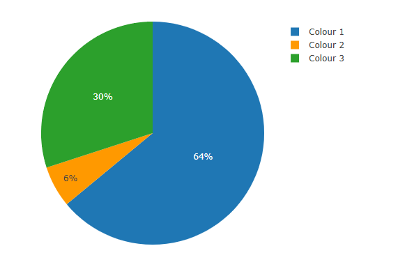
I asked my peers and some friends that are all within my target market to tell me which colour pallet option they liked best. Having explained my games narrative and environment the majority choose option number one and favoured number 2 the least. In consideration number two had a colder harsher colour pallet, now having understood that i doubt it would fit into my games environment seamlessly.
Final Design: