Inspired by games artistically such as ‘Fran Bow’ and ‘Sally face’ flash before my eyes is a 2D style game with a mostly vibrant and cartoonish art style. With visible brush strokes and chunkier shading styles the games art vaguely resembles that of a children’s picture book.
Artistic Style:
- mood and colour pallet
The game will have a bright colourful pallet to oppose the mood of the game but also portray the childlike wonder of the environment.
- Art Style
The art style is scratchy and two dimensional vaguely resembling that of a picture book. Cartoonish and colourful as the we explore the game through a child.
reference:
- characters: visible rougher brushstrokes and scratchy lines, . For the main character use a more muted colour pallet, others vibrant and colourful.
- Environment: Cleaner more visible lineart, minimal shading. Not too much detail
Protagonist:
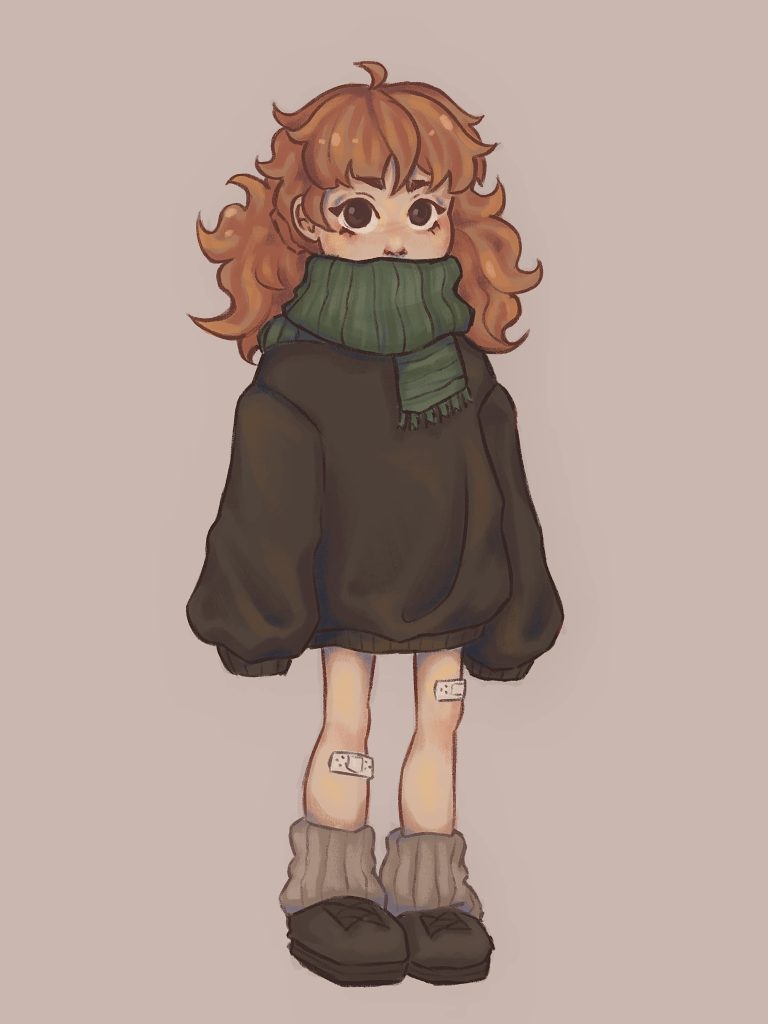
Annabelle is the protagonist of the Gameworld, her colour pallet varies greatly to that used else where. She has a more dull, less colourful colour pallet as opposed to the environment. This is to empathise that she is out of place, doesn’t belong within that timeline. The choice for this colour pallet also plays into the more emotionally upsetting elements of the story that all surrounds her as a character. She is this dull, frazzled, sad girl within an otherwise nostalgic and child-like wonder filled environment.
The rest of her design aligns with the style used throughout the game, with the sketchy line art and style of rendering.
- Age: 8 years old
- Colour pallet: dull, muddier colours such as brown
- Height: 4 feet tall
- Style: baggier loose fitting clothes, hand me downs that look worn and slightly tattered.
Annabelle is an old woman stuck within the past, living out her childhood memories that would otherwise go forgotten. She is clumsy, frightened and doesn’t talk very much, can you the player get her to open up and explore.
Environment:
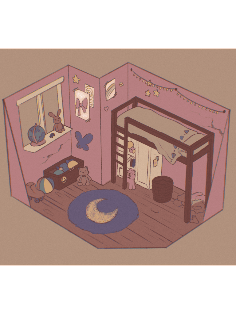
The shading within the environmental backdrops will have minimal to no shading. I want to really drive this two dimensional style and emphasise the child-like qualities within the game. It should feel and look like a memory for the player, with fuzzy, grainer backdrops and a slight haze. Using these elements really helps the backdrop to feel ‘unreal’ and nostalgic, whilst also separating itself from the characters who are in comparison more defined and scratchy. Having the background fade into the scene and not causing any visual clashes or clutter is important and by implementing this style within the backgrounds i ensure there is no visual confusion between the two.
Colour pallet in day: the rooms will be bright and filled with various colours, it should portray the childlike quality’s of the game through this. As if we are seeing the world through a child’s eyes.
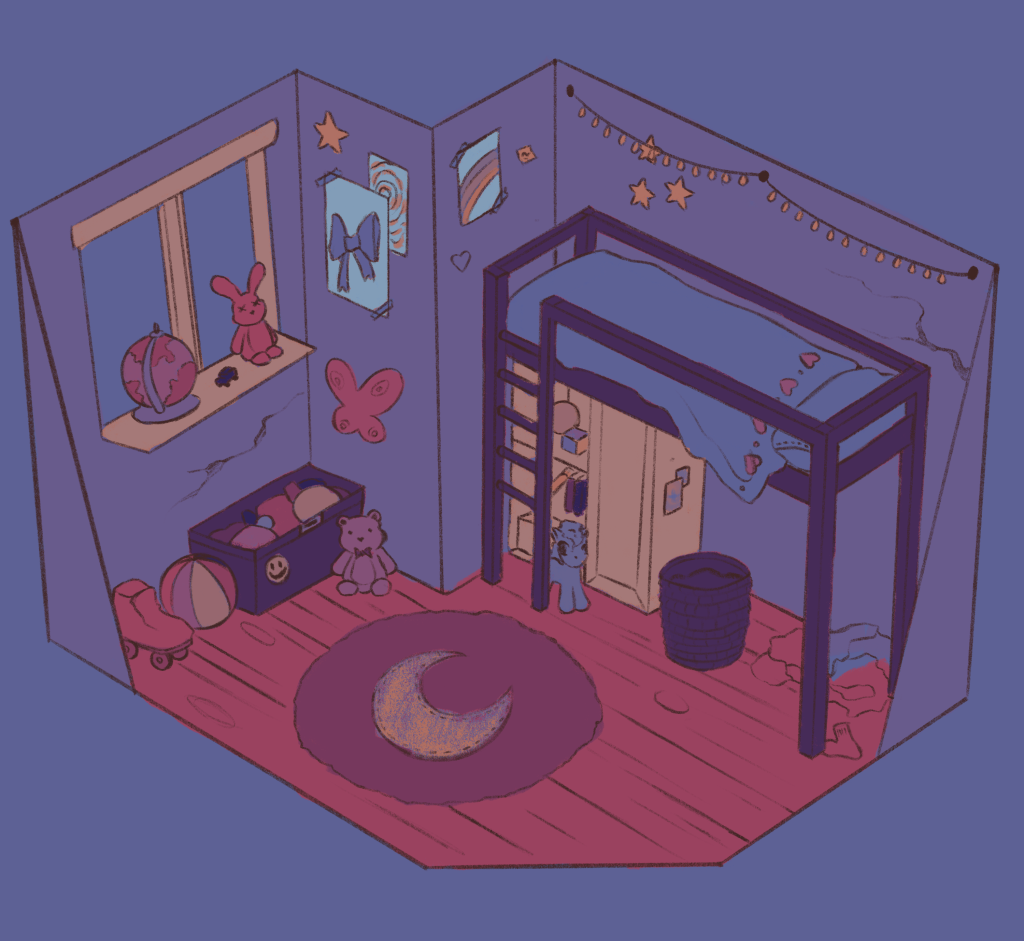
in the night-time the colours should still be vibrant and have these elements of childlike wonder, yet have a darker blue hue. It is difficult to create a colourful environment within a darker set scene, this is why the colours within the scenes end up distorted and unrecognisable in comparison to the daytime. The rooms will be a mix between vibrant blues, oranges and purples. This colour pallet really work because it is undeniably the night-time and that is translated well to the player whilst still having that vibrant, storybook aesthetic prevalent throughout the Gameworld.
user interface:
The user interface will be simple and very intuitive, even for players with minimal game experience. It is plain and implements that sketchy style used throughout the games art. Having the user interface be simple and intuitive is important as the majority of my target market includes casual players and people with less experience when it comes to playing video games.
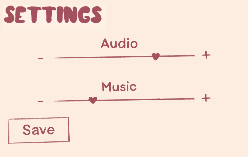
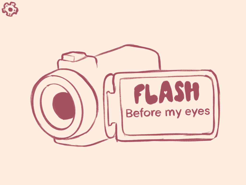
with the loading screen and title screen depicting the same art of the games logo, and the menu being found simply through a cog in the top right corner with few options that would affect the gameplay drastically.