The hotbar used in the sketch Joe made was a suggestion he took from me, who took a lot of inspiration from the UI in Surviving The Aftermath (game research here), which keeps all of the resources at the top of the screen and away from the main action. I was particularly drawn to their way of subtly taking sharp, square shapes and making them softer by completely straightening out the edges.
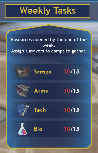
The idea is that the resources and their quantitive value will be displayed along it, in addition there will be two buttons that when pressed will open a new panel detailing information for the weekly tasks as well as the character profiles (although this one is temporary, explained later).
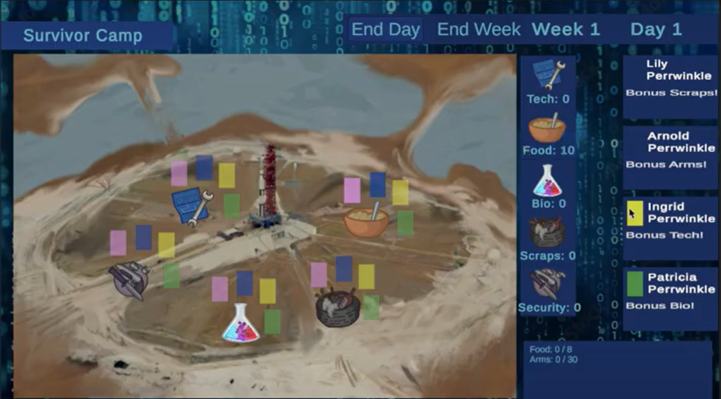
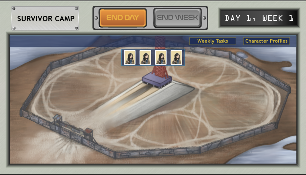
Below is very early incomplete mockup. The NASA sticker in the top left was inspired by a real life sticker, it replaces the original metal plaque shown in the sketch because I felt like the location needed to be better conveyed.
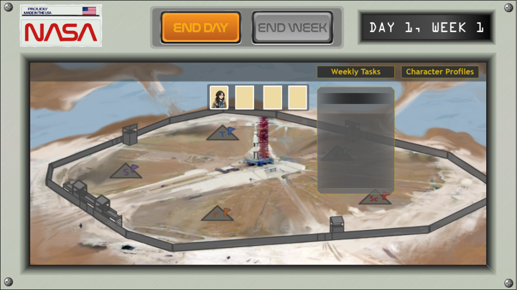
I’m not happy with the colours, it looks sad and drab. While that makes sense for a post-apocalyptic theme – management sims are all about providing user gratification and justification, this was great advice given by games developer and guest lecturer Louis from week 6, and without engaging and pleasing-to-look-at UI, it takes away that satisfaction.
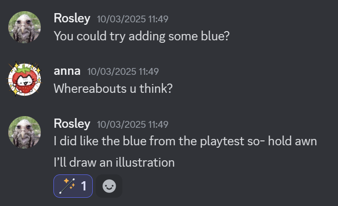
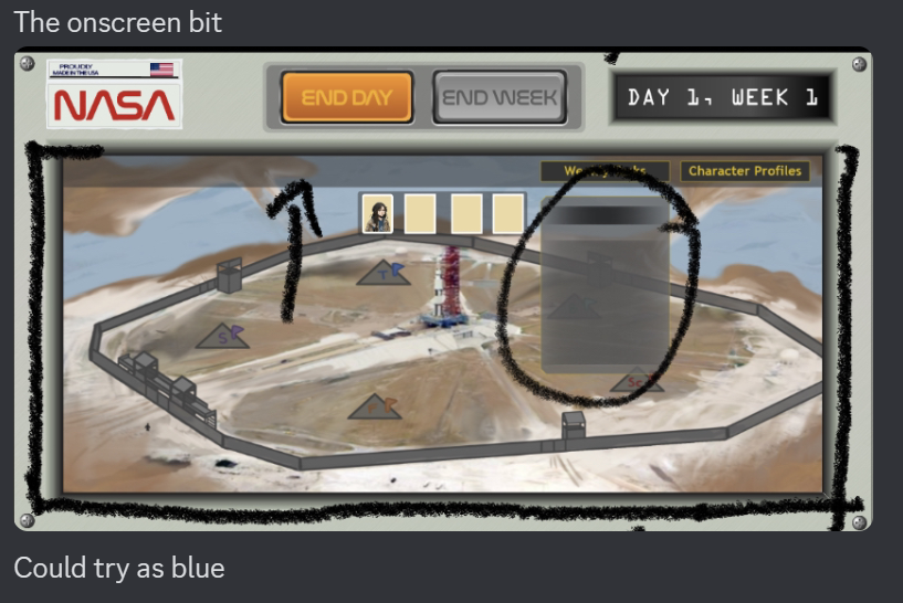
I sent the image to my teammates on Discord, this was the first evidence of UI art they would have received from me so far so I was fairly nervous. Rosie, the Environment Artist, offered me the good consistent feedback when I asked for advice in terms of colour and matching the existing art style.
Changing the colours
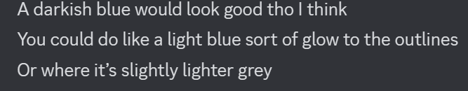
I took the advice and went towards the dark blue look. While Rosie mentioned a light blue outline I was pretty fond of the yellow so I made the decision to keep it in some areas.
Alongside the new colours, I added the resource icons and text, but wasn’t sure about the layout.


The most important information that the resource hotbar needs to show is the numbers, but I felt as though players will be confused without the resource names. Including the names means formatting it in a way that wasn’t crowded. I sent both images off and asked how the team felt.
The general agreement was to continue with the second design. Rosie also mentioned wanting to make changes to the icons in the future, but this isn’t a concern for me right now.
In addition to the colour changes, I also changed the shape of the panels to represent more of an arrow at the top, this way it is clear where this panel is coming from and what information it is displaying. To make sure the text inside of the panels was extra clear, I created a background for the text with a simple rectangle and a darker blue gradient fill.
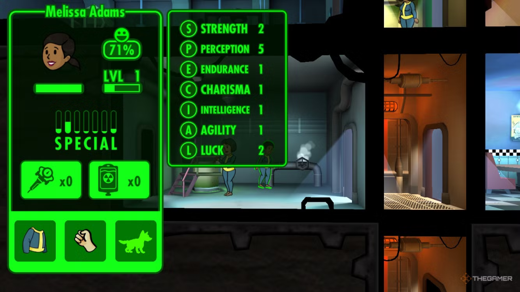
Taking inspiration from the Fallout Shelter SPECIAL skills UI, I used the same text background, included the character names, their pictures and skills from their character sheets to make the character profiles panel. The character profiles are not a huge priority as Joe and I have had discussions of the information being accessed through the survivor cards in the future instead.
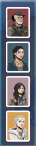
Survivor Cards
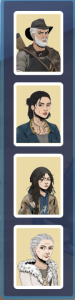
Again I used Surviving The Aftermath as a reference for how I wanted the player cards to look like. While it is a fairly simple design I did make small changes like curving the edges of the white backing and the top edges of the beige background to match with the rounded shapes in other areas of the UI such as the buttons. I had the idea of changing the background colour for each character but without haven’t toyed around with it yet.
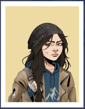
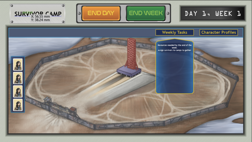
Originally, the survivor cards were to sit below the resource icons like shown above. However, I ended up moving them to the left hand side vertically after Rosie sent me a near finalised version of the survivor camp. I made this change because the cards covered a good portion of the top of the survivor camp, as well as where a camp building would go. (They are currently all Lily because I havent received the character art from Gabi yet).
With Rosie’s help I tried scaling and cropping the background in all sorts of different ways but nothing seemed to work. The best bet was to scale the top of the background down so that the bar wasn’t covering it and move the cards to the side.
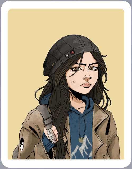
With the character assets received from Gabi, I was able to get a look at what the survivor cards would look like together. The original uniform colour made it feel bland to look at, the characters also didn’t quite stand out, especially Patricia because of how much white there is in her portrait.
Assigning colours to individual characters would help with readability and make things look generally more interesting on screen. I aimed for muted colours that best represent each character – red for Arnold to match his quick-tempered personality, a dark bluish-grey for Ingrid because of its association with sturdiness/reliability, purple for Lily for her ambition, and lastly orange for Patricia as representation of enthusiasm and warmth.
Additional change: removed the bolted metal “survivor camp” plaque and replace with nasa sticker again. Better for environmental storytelling.
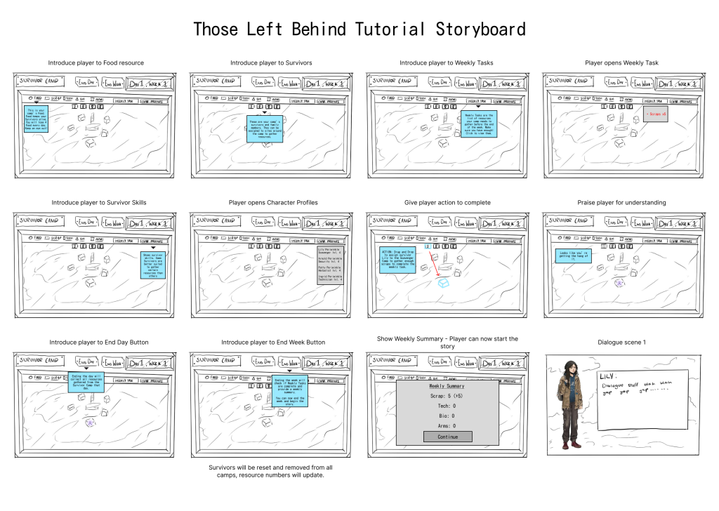
Tutorial Panels
I considered creating separate UI dedicated just to the tutorial scene, and by that I mean taking the existing info panels and recolouring them so that they stand out from the regular gameplay ones. This also meant designing ones that are horizontal to point at the camps (and now the character cards too).
I tried out three different colours – the same dark blue I was already using, a darker orange, and the very light blue colour I used in my tutorial storyboard (left).
I wasn’t a very big fan of the orange or light blue. I think that for now we can stay with the dark blue. If the tutorial is complete and implemented by week 9 for the playtest and we see that distinguishing the tutorial from the core gameplay is important, then I can come back to it.
Leave a Reply