After watching Juniper Dev’s short video “The Power of Font In Video Games” I began to really consider how typography could play a crucial role in establishing the game’s post-apocalyptic, retro control-room aesthetic. The game’s chosen font must balance readability, immersion, and thematic consistency with the overall art style, which almost resembles a graphic novel.
Goals
- Convey the Retro-Futuristic Theme – The UI should feel like an old, neglected control machine from a past vision of the future.
- Ensure Readability & Accessibility – Text must be easily legible while maintaining an aged, industrial aesthetic.
- Support Environmental Storytelling – The typography should reinforce the world’s collapse, bureaucracy, and decay.
Considered Font Styles & Evalutation
Immediately I wanted to find fonts that avoided serifs (the little lines that hang off of letters, think Times New Roman) because I didn’t want the game to feel aged – it needs to be implied that the world is set in the near distant future. Additionally, monospace fonts would really help sell that machine, tech look.
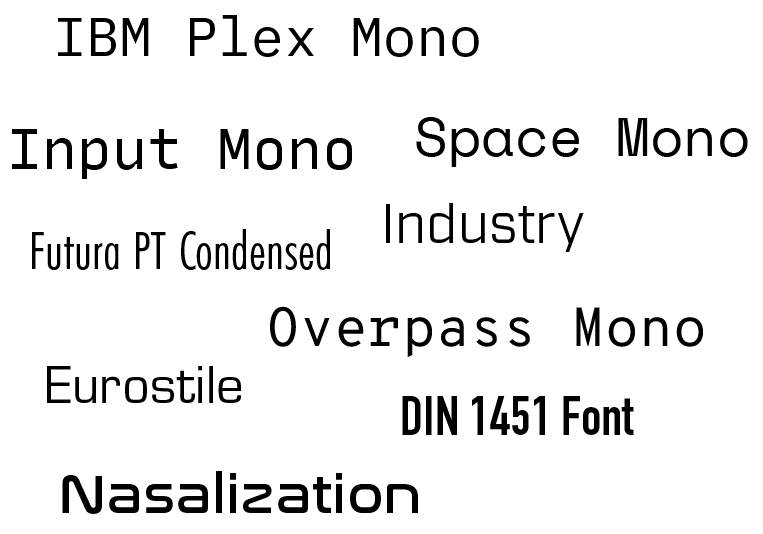
| Monospace Fonts (e.g., IBM Plex Mono, Space Mono) | Pros: Resembles old command-line interfaces, enhances the “retro control panel” feel, clear readability. Cons: Can appear too clean or modern, lacks degradation or texture associated with old, damaged tech. |
| CRT & Digital-Inspired Fonts (e.g., Input Mono, Terminus) | Pros: Mimics the look of old cathode-ray tube displays, reinforcing a decayed digital world. Cons: Some CRT-style fonts lack weight variation, which might make UI hierarchy harder to establish. |
| Distressed / Grunge-Inspired Fonts (e.g., Futura PT Condensed, Industry, Overpass Mono) | Pros: Adds visual noise and a sense of wear-and-tear, emphasising a world in decline. Cons: May reduce clarity, especially at smaller sizes. |
| Industrial Sans-Serif Fonts (e.g., Eurostile, DIN 1451) | Pros: Used in real-world control panels and military interfaces, enhances immersion. Cons: May feel too corporate or sterile without modification. |
Final Font Choice
Space Mono (Primary) + Overpass Mono (Secondary)
Before having put much thought into typography, I had been using Trebuchet MS for its readability and playing around with the Nasalization font due to the games ties with the Kennedy Space Centre.
After testing different fonts within the game’s UI, Space Mono was chosen as the primary typeface due to its monospace structure, retro aesthetic, and strong readability. It effectively replicates the feel of an old machine while still being modern enough to work with a clean UI.
For secondary or in-world text (such as button labels), Overpass Mono was selected due to its slightly more condensed and industrial feel, reinforcing the rigid and bureaucratic tone of the game world.
Reflection
The selected typography integrates with the game’s UI without compromising readability. While some grunge-style fonts initially seemed like a strong thematic choice, they ultimately detracted from clarity. The final combination aims to maintain the feeling of an outdated yet functional control system while ensuring players can quickly process information.
Future refinements may include:
- Experimenting with slight distortion or scanline effects on text.
- Using color-coded text (e.g., red for warnings/incomplete tasks, green for success/complete tasks) to improve usability.
- Adjusting text size and spacing to optimize UI hierarchy.
Leave a Reply