Designing the background means designing the machine itself, this includes the screen borders, my biggest inspiration for this is looking at control room machines and CRT monitors/screens.
My first attempt did not go well. Nor did I enjoy it. I also tried using Photoshop to design it which is probably why it was not good.
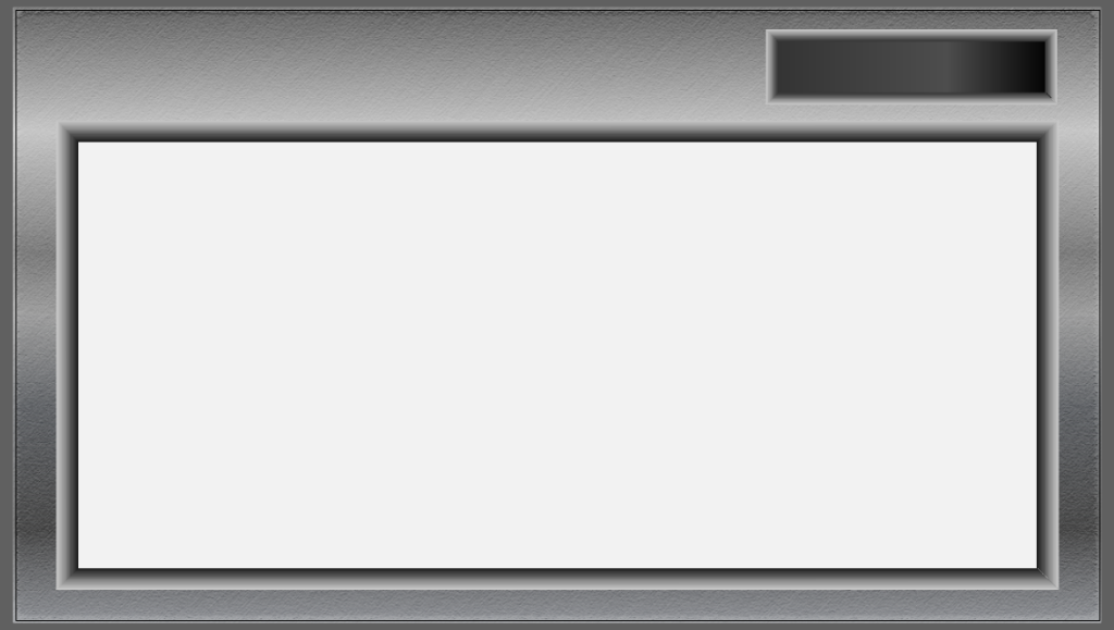
I wanted that brushed steel look to the machine, similar to the ones I researched prior to starting. Following a tutorial to create a metallic effect, I began with a 5-point gradient of greys and used a further two layers to add a lot of grain and blur which created that horizontal scratchy look of metal.
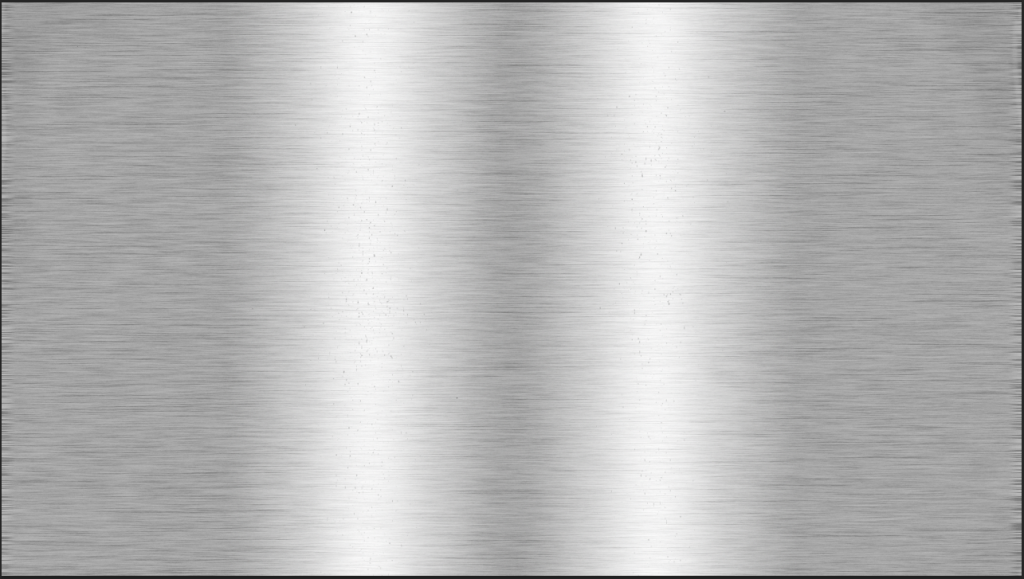
This looked way too realistic and uncomfortable to look at, it was giving more Samsung fridge freezer than anything. Alas I persisted and trusted the process and went on to map out the screens. Looking back now, this was not the correct way to do literally any of this, but it’s a learning journey.
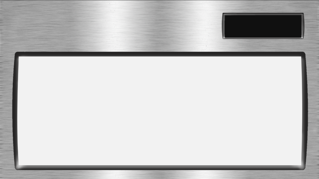
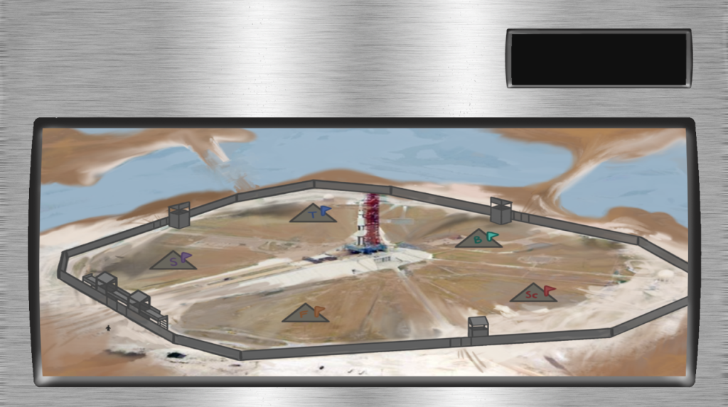
After sitting in disbelief of what I had just created, I decided to retire from Photoshop and do things the correct way. While the design was incredibly … not good, it has the potential to be a killer product concept for a futuristic microwave.
Attempt 2
Hopping onto Illustrator, I still had the same plan. I know my way around Illustrator far better so this was a safer space. I still wanted that brushed metal look leading me to toy around with the adobe filter effects. I created the brushed streaks using the angled strokes effect over a 3-point gradient of grey colours.
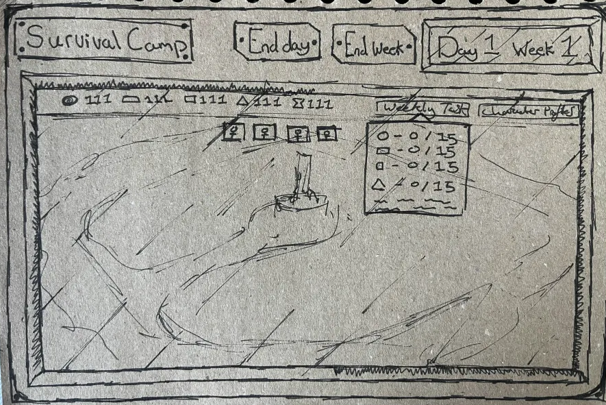
Before I could take a screenshot of the background, I decided I should instead carve out the areas where the screen would go. Using Joe’s sketch (left) as a reference underneath, I drew a rectangle with a gradient on the stroke to add depth. I did the same thing for the smaller screen at the top.
I (once again) really wasn’t a fan of this. I got up a reference image of an actual machine (who would have thought that would be a good idea) and colour picked from the image.

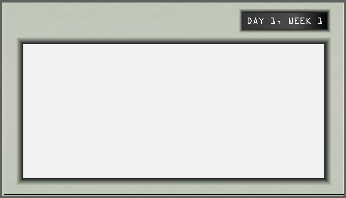
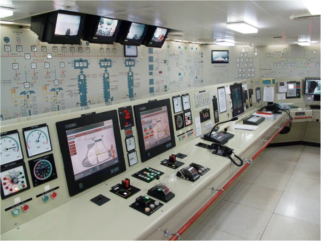
This sad greenish beige gave me oh so much confidence. I wasn’t completely satisfied with the texture as I started considering a more plastic look than metal, however because this change wouldn’t be difficult to explore I could come back to it at another time after seeking out some feedback.
I was now feeling ready to build on this and move on to designing the buttons.
Leave a Reply