When looking for references for buttons I found a community of people who create their own custom button panels for games, one niche I found was for flight simulation games, Elite Dangerous in particular. I also had a snoop around itch.io and the asset packs that were available, I did this to get a feel for style and to get an idea of how to layout my own assets when I finish with the UI.
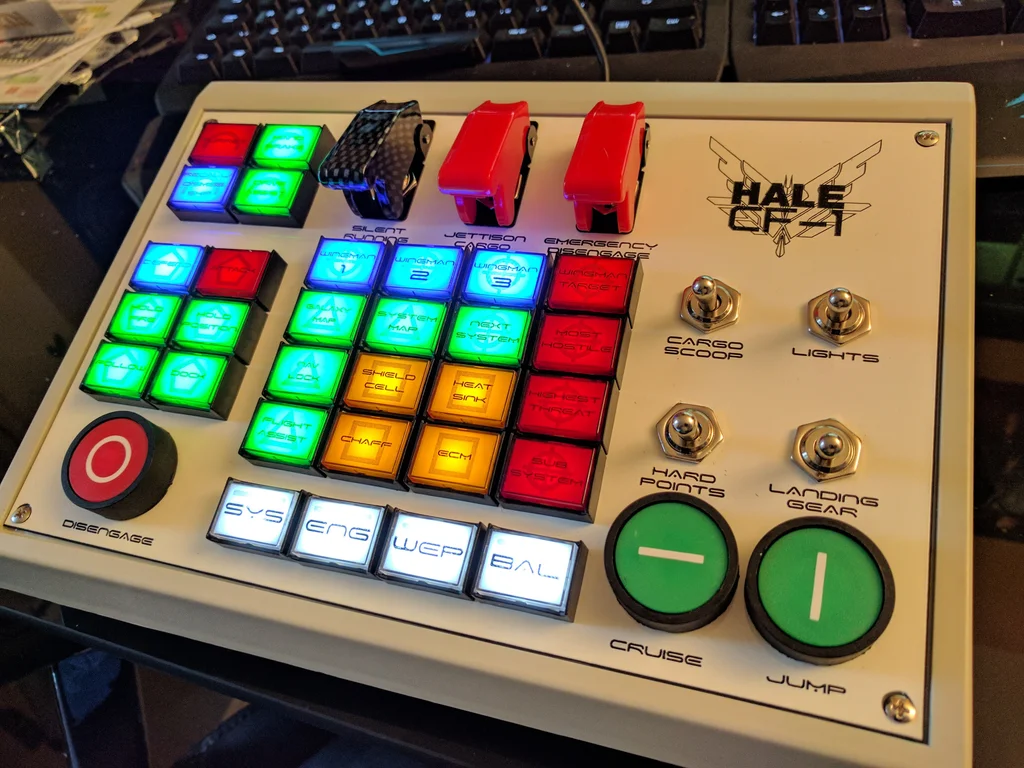
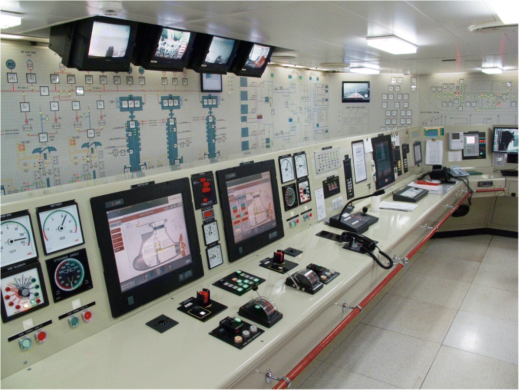
I’d also gone around and taken pictures of buttons and panels I found that were good references for the design.
Itch.io packs that I most found interesting: Doomsday Button Panel and Sci-Fi UI
Round or Square?
| Circular Buttons | Square/rectangular Buttons |
| ✔ Best for: Minimalist, futuristic, or touch-friendly interfaces ✔ Pros: – Looks sleek and modern – Takes up less visual space ✔ Cons: – Less space for text/icons – Harder to align neatly | ✔ Best for: Traditional, structured, or text-heavy UIs ✔ Pros: – More space for labels and icons – Easier to arrange in menus – More familiar and readable ✔ Cons: Can feel rigid or outdated if too sharp-edged |
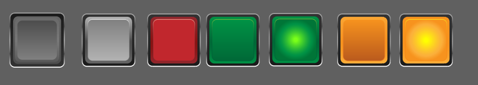
To reflect the retro-industrial, analog machine aesthetic I’ve decided on square/rectangular with rounded edges – like older industrial control panels with large mechanical buttons.
For design & feel I’m going to aim towards:
- Chunky, tactile-looking buttons with metallic or plastic textures.
- Flickering indicator lights (light up for active, no light for inactive).
Following the tutorial below, I adapted the steps to create something more alike to what I was aiming for:

This looked too futuristic, and its dark colours would contrast way too much with the background I had made. I liked the roundness of the shapes edges but it was just a bit too “much”. I went ahead and lightened up the colour, removed the light effect and a couple of layers to further simplify the shape. I was able to retain that raised 3D effect by using dark to light gradients on the stroke.
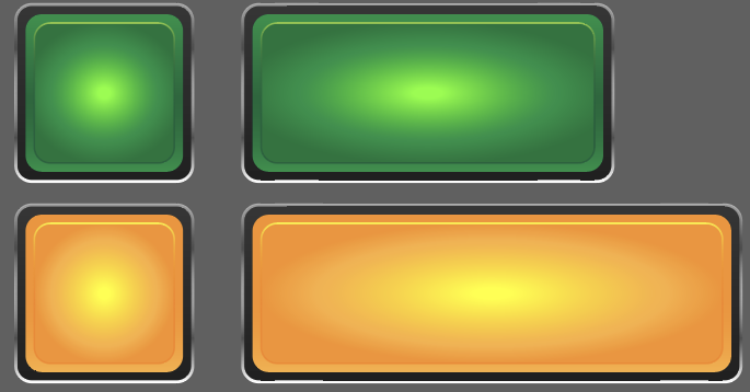
I focused on the colours most commonly seen on control panels – white, grey, red, green and orange – and made duplicates with the different colourways.
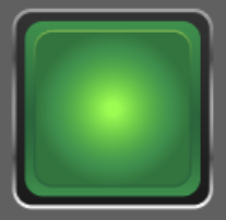
To create the effect of a light behind the button I changed the fill to a radial gradient, keeping the central colour bright and building out to the original colour.
Last Steps
Being able to 9-slice assets means they can be scaled in however way and still retain their appearance, this is especially important for buttons in UI for reusability when implementing them into game engines.
In Illustrator, the way I found to do this was by turning my buttons into symbols and enabling 9-slice guidelines. This worked perfectly for the most part, the issue I was having was with the buttons in their pressed light state. When the scale of the button was adjusted the radial gradient used to represent a light behind the button was stretching weirdly and just didn’t look good.
I tried googling if anyone had a similar problem when scaling their gradients, while I didn’t find any exact answers, one suggestion was to expand the appearance the create a gradient mesh. I was skeptical because the gradient mesh purpose is to create shading effects.
Progress! The gradient is behaving but now the outer shapes of the buttons are stretched incorrectly. Close enough. After taking a break and coming back, I made a couple more duplicates of the original and repeated the process of changing things ever so slightly. In all honesty, I’m not sure what I did or what I clicked but I was able to create a button that scaled properly.
Fitting them in
The buttons would look strange just being slotted ontop of the machine so to make them stand out more and to help ensure the player knows these buttons are interactable, I designed a quick panel that would go behind them. To further sell the look I repurposed the screw head I drew for the control machine background.
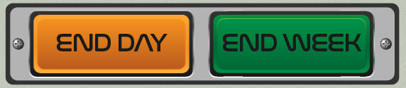
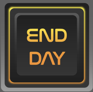
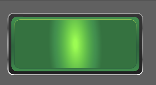
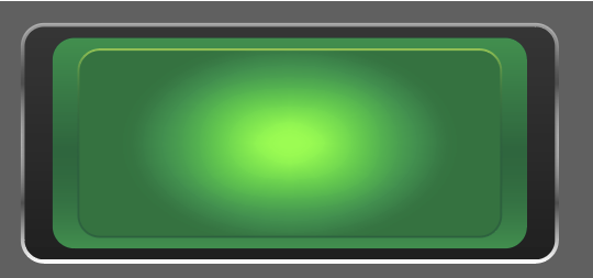
This is also when I realised that the “End Week” button is green, this was a pretty silly mistake as the number 1 rule in the art direction is that the game is strictly meant to have NO green. Whatsoever. This was a case of choosing between red or blue as I wasn’t happy with the grey colours, orange had already been used and green was off of the table.
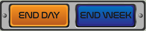
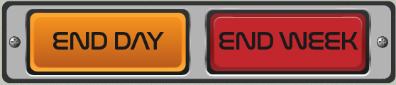
My overall design already uses quite a bit blue for the panels and resource bars, the darker blue I used for the button made it so that there wasn’t enough contrast between the black text for my liking. My only concern with the red is that typically the colour red alludes to danger and a big red button usually signals the intiation of impending doom or destruction (especially one that literally says “END WEEK” on it) and I don’t want players to be influenced by that.
In the end, I found that the better choice between the two was the red button. If changes need to be made, I’m happy to do so.
Leave a Reply