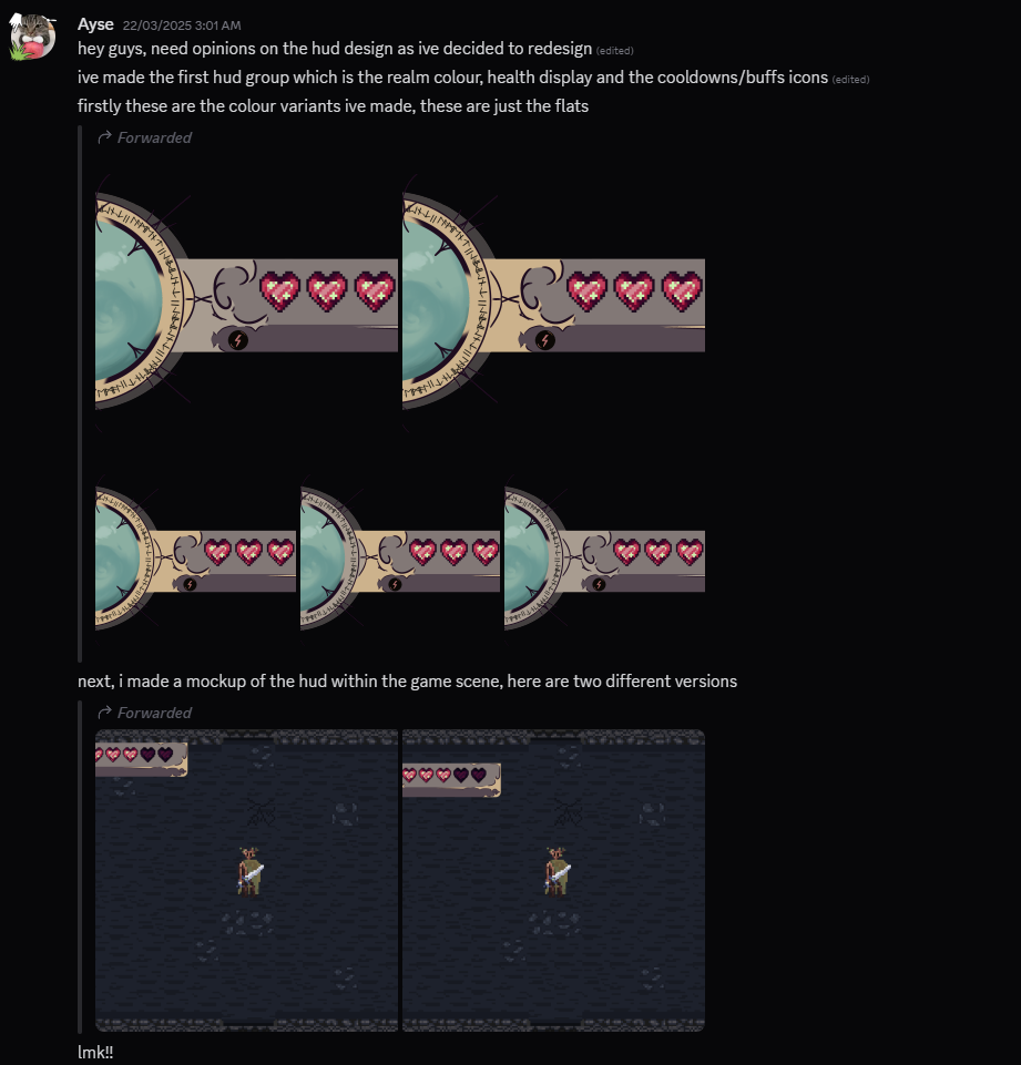
As shown before, I only added the hearts UI to the HUD, but I knew we had plans to add other aspects to the game’s interface, so I wanted to plan the layout to fit all of these in and centre their designs around complementing each other. Therefore, I wanted to make a few mockups of the HUD’s layout.
GDD Information + Planning
Referencing back to the condensed version of Anna’s GDD, I needed to keep in mind the few attributes of the UI/HUD that she wanted for Lament.
Key Factors I must Include:
- Minimalistic Design, including flourishes like runic patterns or glowing borders
- Font similar to the title style
- Icons for resources
- Red for hearts
- green for Terra shards
- white for Terra souls
- The hearts, resource counter and equipped weapon should be shown in the top left.
- Minimap, if included, must be in the top right
For our vertical slice, we will only be having the sword as the weapon option, therefore, the equipped weapon icon isn’t a high priority to include. However, a resource counter is very common in dungeon crawlers.
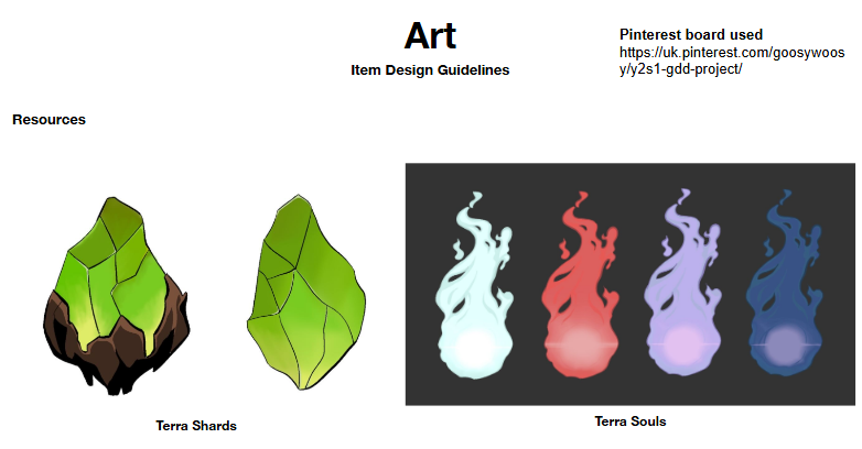
I must keep in mind the designs of Terrashards and Terrasouls from the GDD when creating the icons for the HUD to represent the count the player has.
Development
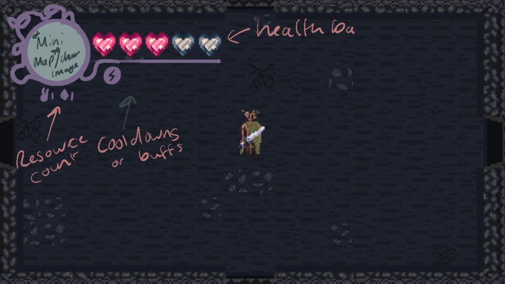
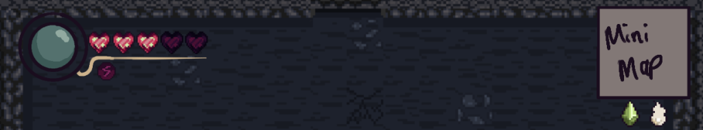
The first mock-up included key factors such as the heart display, minimap, resource counter and the cooldown for the dash. However, it doesn’t match the design guidelines set out by the GDD like the colours of the hearts.
Also looking back, we were only supposed to have three hearts but based on the gameplay we have, five would make the game more enjoyable than three. I also feel as though the minimap doesn’t make sense to be there, as the HUD seems to all be squished in the top left.
Currently, the HUD takes up too much screenspace and may negatively impact gameplay. Therefore, I need to make some alterations.
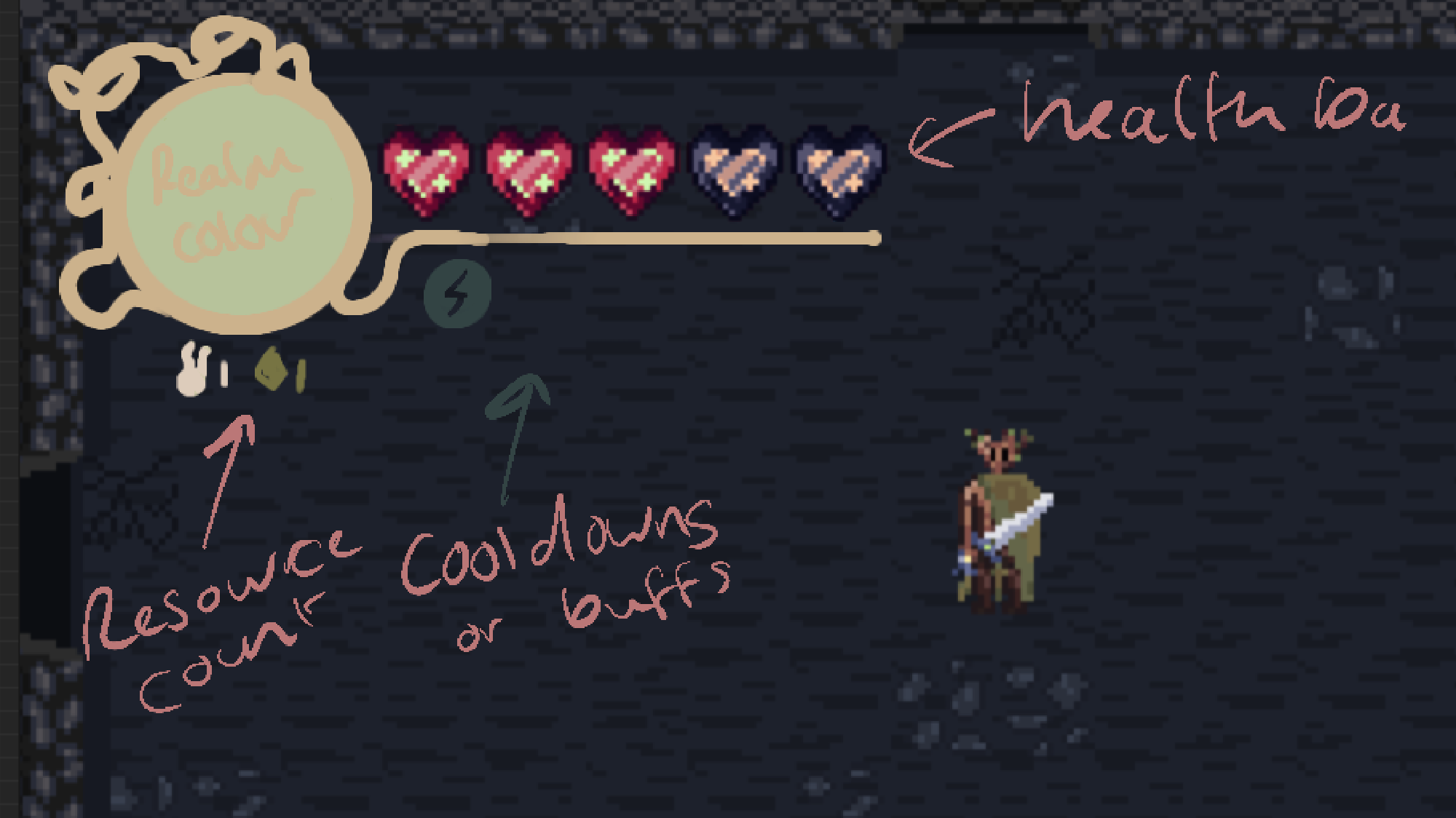
In my second iteration, I darkened the hearts display to try and get a deeper red colour, but it made the empty hearts begin to blend in with the background so I will need to tweak that again. I may be able to fix it by creating a background for the hearts to seperate the space.
I changed the cool down icon colour but I feel like it’s too similar to the background as well. The resources are now the right colours according to the GDD and look much better, however, I am trying to work out where the number counter should be.
I also changed the container to a gold colour rather than purple and replaced the minimap with a orb representing the realm the player is currently in by matching the environment colour. This will help the player remember where they are currently in the game.
Team Discussion
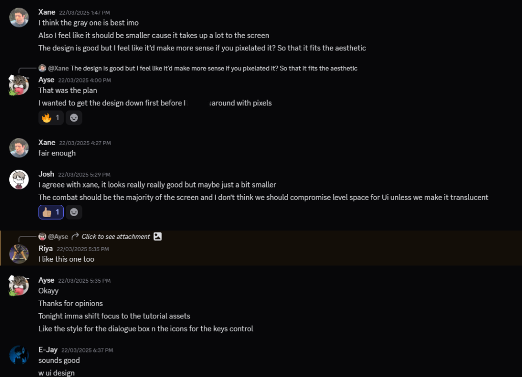
Final Concept Design
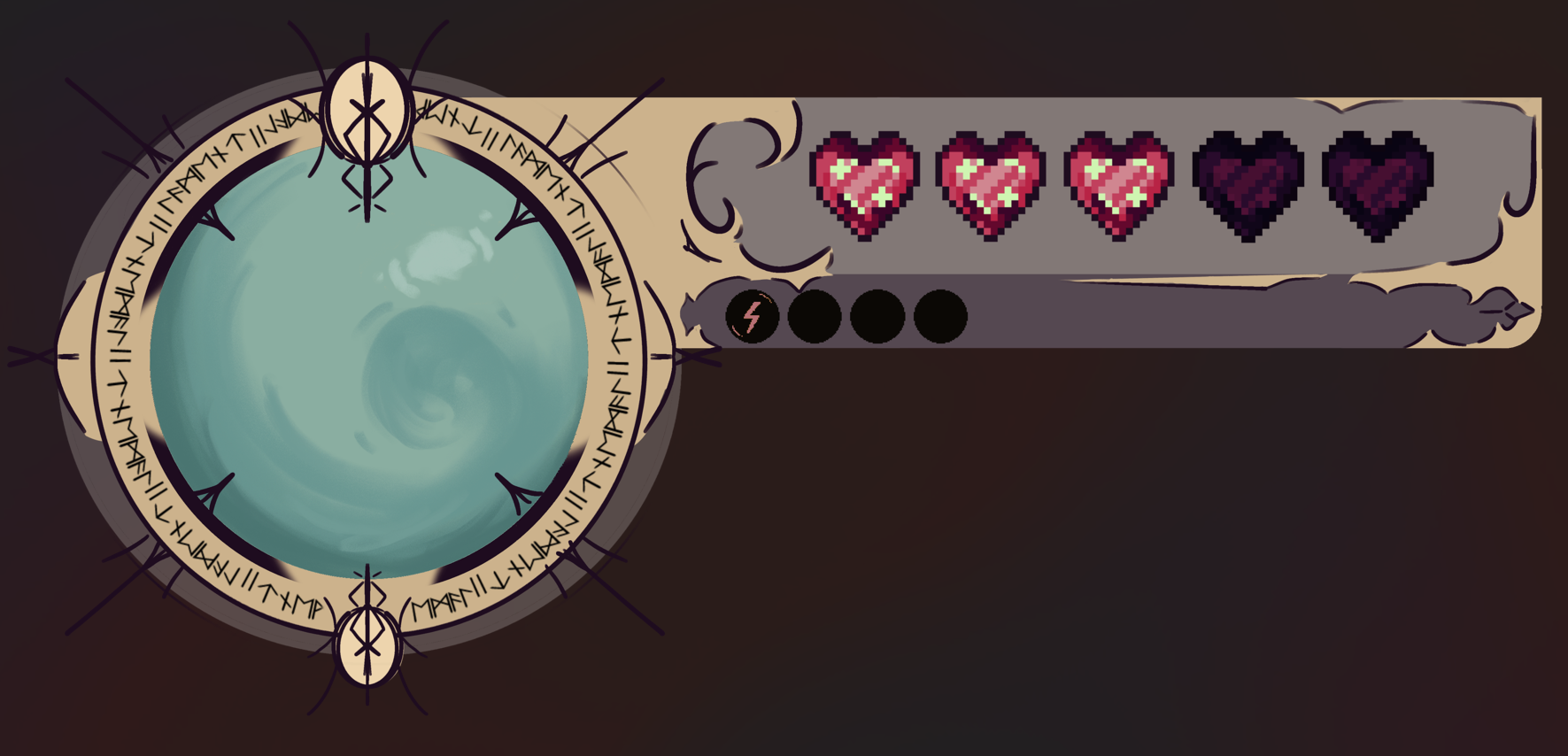
I added in all the aspects Anna desired within her GDD, whilst also meshing my new ideas of the location orb, dash cooldown and the heart designs I created previously. I liked how this turned out, it was a struggle but it feels perfect for the game. From the feedback my teammates gave, this was the version that was the best. As this isn’t the top priority for our second play test, Ill pause development on this for now until the tutorial is completed. They did feel like it could be smaller to not clutter the screen, but when I redesign the HUD, that will be my main focus. For now, this HUD does what it needs to do. The refining stage of our game is when I’ll make the final version.