Planning + Research
Before starting the design, I wanted to get some inspiration, so I made a mood board. I knew that I wanted the health to be hearts/individuals as it would fit the dungeon crawler theme more, instead of a bar.
Initial Heart Design Process
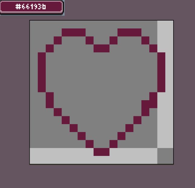
I created a new Aseprite file with the size being 18×18. This size is small, but it allows for cohesive pixel art. I then created the outline of the heart with the colour #66193b.
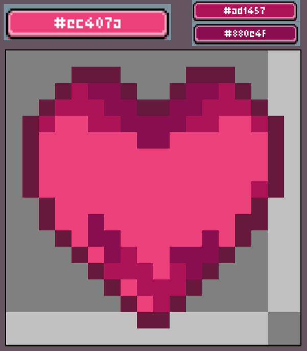
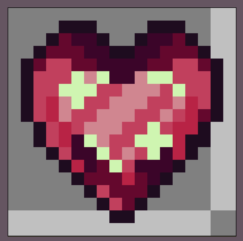
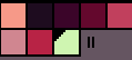
I then filled in the heart with a high saturation colour #ec407a, then I added in midtone with the colour #ad1457 , and shadows with #880e4f.
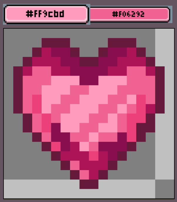
I then proceeded to add in the highlights of the heart with the concentration of brightness being in the middle of the heart #FF9cbd, this gives dimension to the sprite. I then broke up the highlight with a colour similar to the midtones I used previously #F06292, which gave it the gem-look I desired.
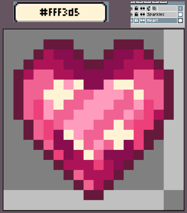
I created a new layer called ‘Sparkles’; this is where the bright highlights (#FFF3d5) of the heart will be. This will also help set me up for when I want to begin animating.
Mockup Experimentation
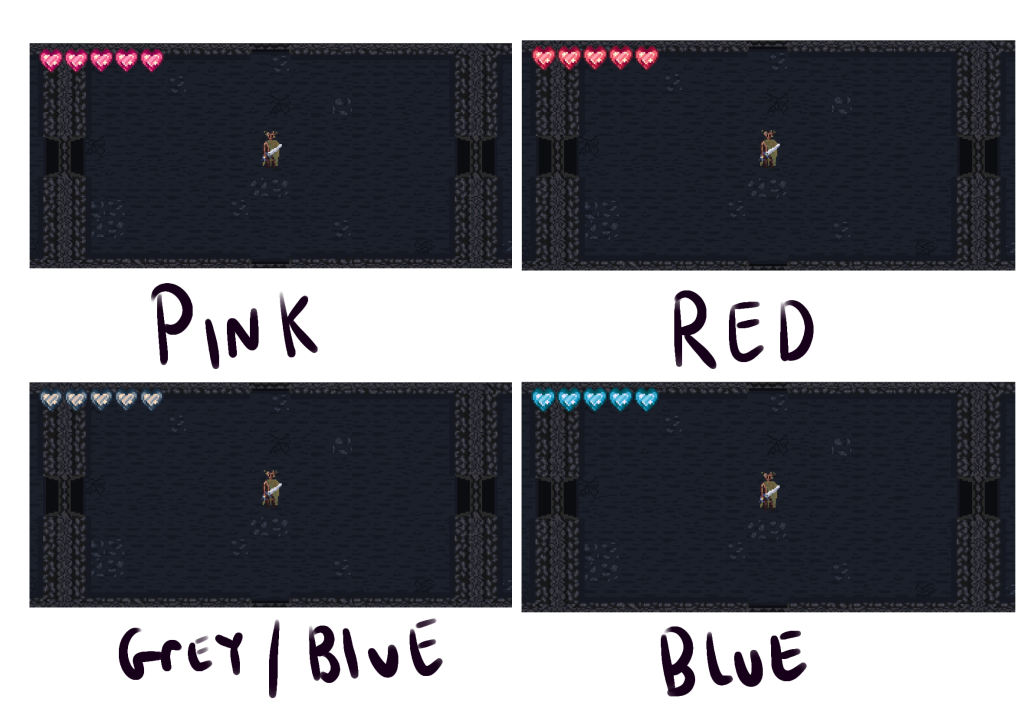
I knew that I wanted to explore other colours for this design as I felt like the Pink palette wouldn’t fit in with this game’s dungeon setting. So, I created four mock-ups of the game screen to test out three other palettes, as colours have context. I applied these different palettes using gradient maps so the values of the colours wouldn’t change.
Group Feedback
- ‘I like pink best, but for the games theme, the grey/blue makes the most sense’ – Xane
- ‘I like the red and pink, but the red is less unique’ – Myself
- ‘I think the red or pink looks best’ – EJay
Personally, I like the pink or red, but I did debate on the grey/blue. As our vertical slice will be the depression branch, the grey/blue would fit the theming better. Xane agreed with me on this. But I thought deeper; if we were making the full game, the grey hearts wouldn’t match other branches like anger or bargaining. So I asked again about it. We concluded that we could use the grey/blue to represent empty hearts and the red or pink to represent full hearts.
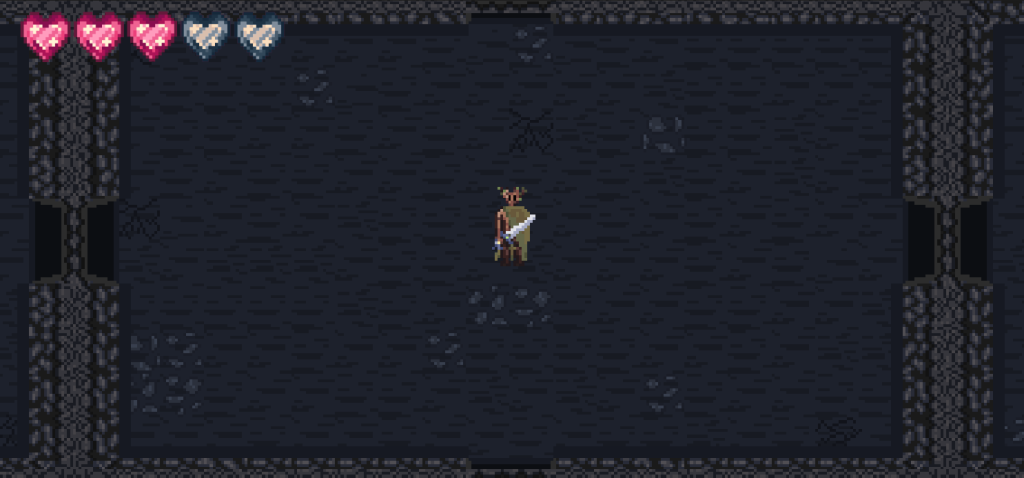
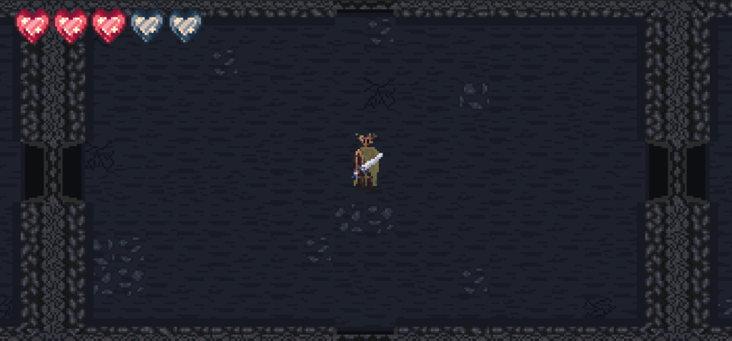
These are the concepts of a half-full health bar, We decided the max health for the player would be 5 hearts as well. After viewing this, the majority preferred the red health bar concept (right) compared to the pink (left) as it fit the environment and player the best.
Second Iteration
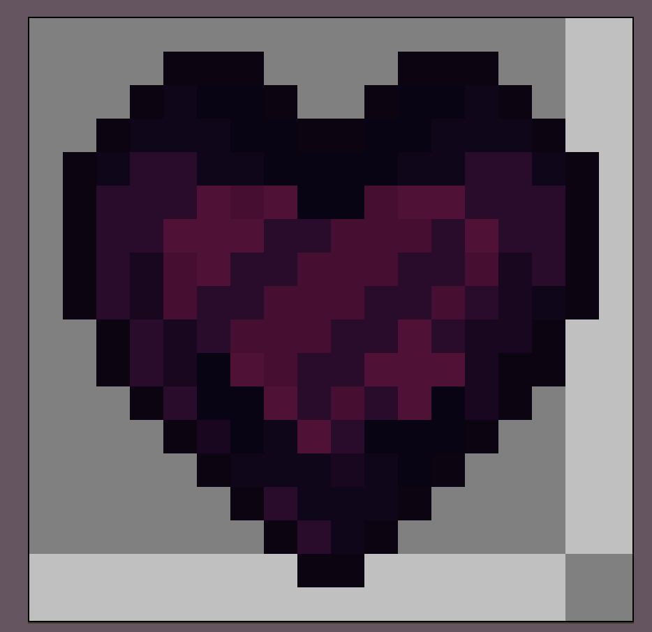
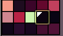
When placing it in the context of the game, the colours didn’t fit the existing palette. I then sat on this design for a while to think of a solution. Colours can appear different depending on the surrounding colours, this is called colour context. I knew I needed to tweak the colours so I utilised gradient maps to experiment. I made the palettes of both heart types closer together as the different hues were making the UI an eyesore. These were the two colour redesigns I made and their palettes.
Full Heart
Empty Heart
After I did this, I created another mock-up of them in the scene, but with the additional aspects of the HUD as well for contextual experimentation. See that here.
Personal Review
I really liked the outcome for the hearts design, it really fits with the game whilst also being prominent enough to draw the player in to pay attention. As I develop the HUD design further, I may need to tweak this design slightly to create a harmonic colour palette with the finished HUD, but that will be discussed further in the HUD posts. I am used to drawing but did find it difficult with the detail limitation that comes with pixel art.