Prep for this Week:
Play : User Inyerface
For this weeks prep we were assigned to play userinyerface.com. Right off the bat, the name is already ringing alarm bells with it being misspelt (inyerface should be interface) which makes me think that its going to be a play on words with ‘in your face’ an idiom for something that is aggressive/forceful that cannot be ignored.
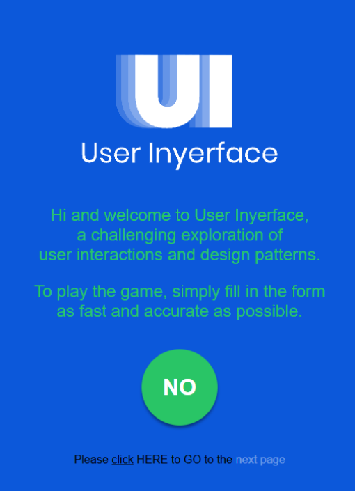
This web game was the worst user experience I’ve ever had. The intention behind this game was definitely to showcase how bad UI/UX design can mess up your game’s whole concept/experience. I could only play through one page as I just got so frustrated playing this that I didn’t find it worth putting myself through this web game any further. This definitely reflects the naming convention of this game.
Buttons dont match their actions, when filling out boxes the placeholder text isn’t automatically deleted, things that look like hyperlinks from highlighting the text aren’t, statements to agree/disagree to dont match their action (ex. I do not accept the terms and conditions is tickable when you must agree to progress).
Looking deeper into the game, even the source code is awful and poorly optimised with unnecessary code or bad variable names etc.
What is a game ui – menus, feedback of the state of the game, part of game world, gives information related to what’s happening in the game.
Types of ui
Diegetic , non diegetic, meta, spatial
Meta blood splatters indicate health not a life bar
Diegetic
Non diegetic traditional ui,buttons menus
Spatial
Don’t want to overload the player, but can use multiple types
Need to be readable
Badly done diegetic ui and non diegetic ui can be confusing
To consider elements, why and importance
Non diegetic ring menu life meter level map usually very present
Diegetic futuristic ui overlays, in game gadgets, physical limitations
Spatial selection auras, racing lines, object text
Meta for color filters, grime, scrolling text
Consider..
Does the component exist in the games story
Does the component exist in the games world space
Figma can be used to experiment with ui
Brainstorming which elements to consider for ui
(Details) other aspects to consider – Visual consistency, typography, grids, colour, iconography, shapes=form follows function
Visual consistency – organising, contrasts
Organising – (balancing) Gestalt principles
Tutorials or learn by doing
Affordances – signifiers (a chair is inviting you to sit from how it conveys that action/invitation from format to invite an action)
If u have to label a door whether to push or pull then it’s not intuitive and is bad
Concept comes from cognitive psychology don norman
The materiality of play concept – consider the body as hardware
Loss of control through narrative decision of experience (death of character locks away a previously used power etc)
Points to consider…
Screen size, image quality, card size, print resolution
Audio output (headphones, surround sound speakers)
Play contexts (portability, hand held)
Market contexts ( price points, platform expectations, where is your player ship)
Possibilities for coop play
Input controls
Accessibility
Play contexts (at home, play on the go, distractions)
Comparing game devices
Haptics feedback on certain devices consider
See controls as adjectives and metaphors
I am bread, crazy controls
Before your eyes, controlled by players eye blinking, very narrative based
Button mapping mechanics on console controller
Future of video game input, vr, integration
Play date console
Task : Decide on device and input controls and answer the useful questions below
- What affordances are key? (Minimum spec)
- What inputs are required?
- What outputs are required?
- What contexts will it be played in?
- Players relationship with device? Players access needs?
- How do your decisions support the intended player experience?
- Will you adhere to ‘standard grammar’ for this device or will you subvert expectations?